I feel very lucky that my favorite conference came to The Netherlands exactly in the year that I’m here too: Held from Oct 9 to 13 at Grand Hotel Krasnapolsky, ATypI Amsterdam was an amazing, rich experience, and after two years of absence made me remember again why I (still) call this my favorite. While other, mostly smaller and more specialized (and cheaper) conferences have been sprouting in recent years, the sheer concentration of type folks at ATypI – smart folks, friends and heroes intensely engaged in presentations and discussions on type, soaring to dizzying heights of concept, diving down to infinitesimal levels of detail, from ever-changing perspectives – makes ATypI a delightful overdose of type-related content and, as Toshi tweeted, unmissable.
It was quite a special instalment for me, as the entire TypeMedia class of 13/14 had been drafted as volunteers. I was part of the video team in charge of recording the presentations, but spent about as much time running around to fix last-minute issues – looking for microphones or people, passing on messages, copying files around, drawing signs to point out where coffee was served or type critiqued. And trying not to pass out (I was in somewhat shaky health). The multitude of interdependent tasks sometimes seemed so confusing on the ground that I – like everyone I spoke to – am very happy with how smooth the whole thing ended up going. My hat is off to Marina Chaccur for the organization! I was super excited to be part of the whole thing, except that I managed to lose my voice the day before the conference started (pro tip: this is not a good idea). If you met me there and I croaked/hissed at you, I’m officially sorry, and I hope you didn’t get a cold. I’m so glad I managed to stay tuned.
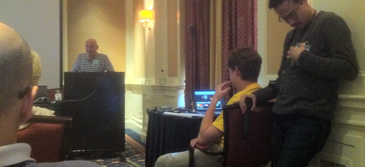
My typical perspective in the “B” track. Here’s Paul Dijstelberge speaking, James and Mark on video duty too
The first two days ran in two tracks; I was in the “B” room, which on Wednesday was dedicated to technology and on Thursday to language/history/education. To me, the level of interestingness both of the content and the speakers varied wildly on those two days. I didn’t see anything that really would have put me to sleep, though; and there were some real gems among these smaller talks on perhaps more niche topics. My favorite presentations were those that looked with precision, rich knowledge and perhaps a bit of wit at parts of the process (Frank Grießhammer on kerning, Erik van Blokland on the intricacies of digitization), at terminology (Craig Eliason on how the term “Humanist” ended up being applied to a now rather ubiquitous category of sansserifs), or at letterforms themselves (Peter Bain on Walter Käch’s lettering manual that shows roots of Univers and Helvetica; Paul Dijstelberge on early modern typefaces, looking at type history as shaped by technology). Much food for thought, as always. My least favorite talks were the ones that primarily seemed to serve the propagation of a specific company / service / institution / business model rather than furthering discourse, learning, and exchange. But there were not very many of those.
On Friday morning the main conference was kicked off on the big stage in the hotel’s Grand Ballroom. Presentations here only ran in one track; a slight, welcome reduction in input overload (as well as our workload). Petr van Blokland’s opening keynote was my personal highlight of the conference; looking out into the future of the design profession, it pre-empted many themes that would reverberate through the next conference days: the notion of design as high-level problem-solving; the need of designers to think in (and design) systems, rules, models, rather than single instances; coding as inherently a design technique.
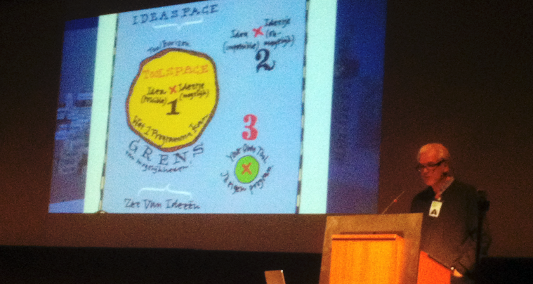
Petr van Blokland on ideaspace vs. toolspace (illustration by Erik van Blokland)
Yet also in the main conference, there was still ample space for very specific, very informed research presentations: Fred Smeijers’ fascinating talk on the justification of 16th-century matrices was one of my favorites; a precise, captivating look at a part of the historical process that I previously knew very little about. Another highlight was a comprehensive look at the development of Microsoft’s new optically-sized screen font Sitka – a dialogue between typeface design and readability testing, presented, in turn, by way of a fine dialogue by Matthew Carter & Kevin Larson. Maybe inspired by the conference theme (“Point/Counterpoint”), quite a few presentations were delivered in dialogue – mostly to great effect. We got to meet Font Bureau’s magnificent duo, David Jonathan Ross & Cyrus Highsmith and their work (I’m a fan), and a couple of teams presented their projects together: Indra Kupferschmid & Nick Sherman on Type Record, Irma Boom & Paul van der Laan on the Rijksmuseum identity.
The liveliness with which these duos passed content (and mikes) back and forth deflated in the anemic panel on free/libre fonts comprising six figureheads and no critics. Their scripted-sounding exchange about the quantitative successes of Google Fonts et al seemed rather out of place in a conference so centered on learning from each other to further the craft; it felt a bit like an (uninspired) housewares sales event, and controversy was dodged even in the Q&A: “Yes, we could talk about business models all night. Now, does anyone have a question on … collaboration?” Nobody did, and we rushed off to drown our frustration at the apparent impossibility (or indesirability) of real dialogue between the libre types and the type scene proper in coffee and really good pastries. To me, the low point of the conference (not the pastries).
Just like the main conference had started on a somewhat visionary note with Petr’s keynote address, Nick Sherman concluded it with some big and to me, really exciting ideas. He defined the term “Responsive Typography” much larger than it is used in discourse these days. Why, he asked, should we limit ourselves to the idea of serving individualized fonts per browser/platform; why not serve one font file and be able to control it parametrically in the browser? The vision of an entire Noordzij cube in one font file, a parametric font – a nod more to Metafont than Multiple Master.
Speaking of which – Donald Knuth himself made an (apparently rare) appearance at this conference; his acceptance speech for the Dr. Peter Karow Award was humble and gracious, and actually brought a little tear to my eye. The other gracious old man honored at this conference was Gerrit Noordzij, who was awarded the TDC medal. And in him too: not a trace of the pompous self-importance that would for many others come automatically with his level of relevance.
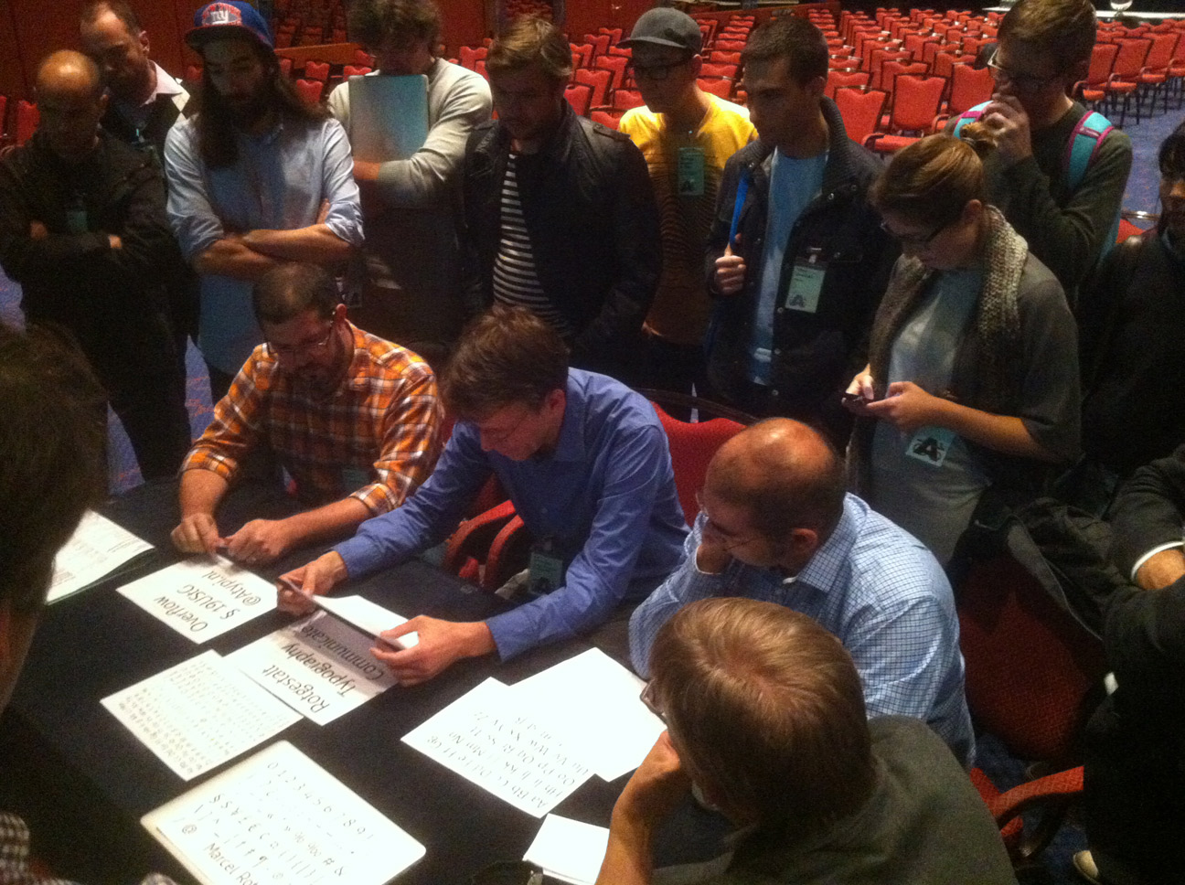
The critical Type Crit jury: Christian Schwartz, Erik van Blokland, Gerry Leonidas; Jan Middendorp moderating
I did not get to see too many evening/side events, but one other thing I very much enjoyed was the first (quite lively) ATypI Type Crit session; I hope this will catch on and continue. As a side note, the conference bookstore operated by Nijhof & Lee was delightful and dangerous, perfectly tailored to ATypI’s somewhat academic typophile audience. But my most favorite thing outside the conference halls proper was the special exhibition put on by the Bijzondere Collecties UVA for their evening reception, and specifically the fact that it featured Bram de Does’ drawings for Lexicon, which are so beautiful they made me want to cry, or grin, or both. I admired them for a long time. “It’s not good for young designers to look at those”, Mathieu Lommen said to me; “don’t get discouraged.” And when I made some comment about Bram de Does never having designed type before and then going on to make two amazing classics: “Well, he spent twenty years looking. Really looking at type. Then he started to design.”
I hope I never stop looking, and learning. Thanks, ATypI. And “Gongratulations” on another great conference!
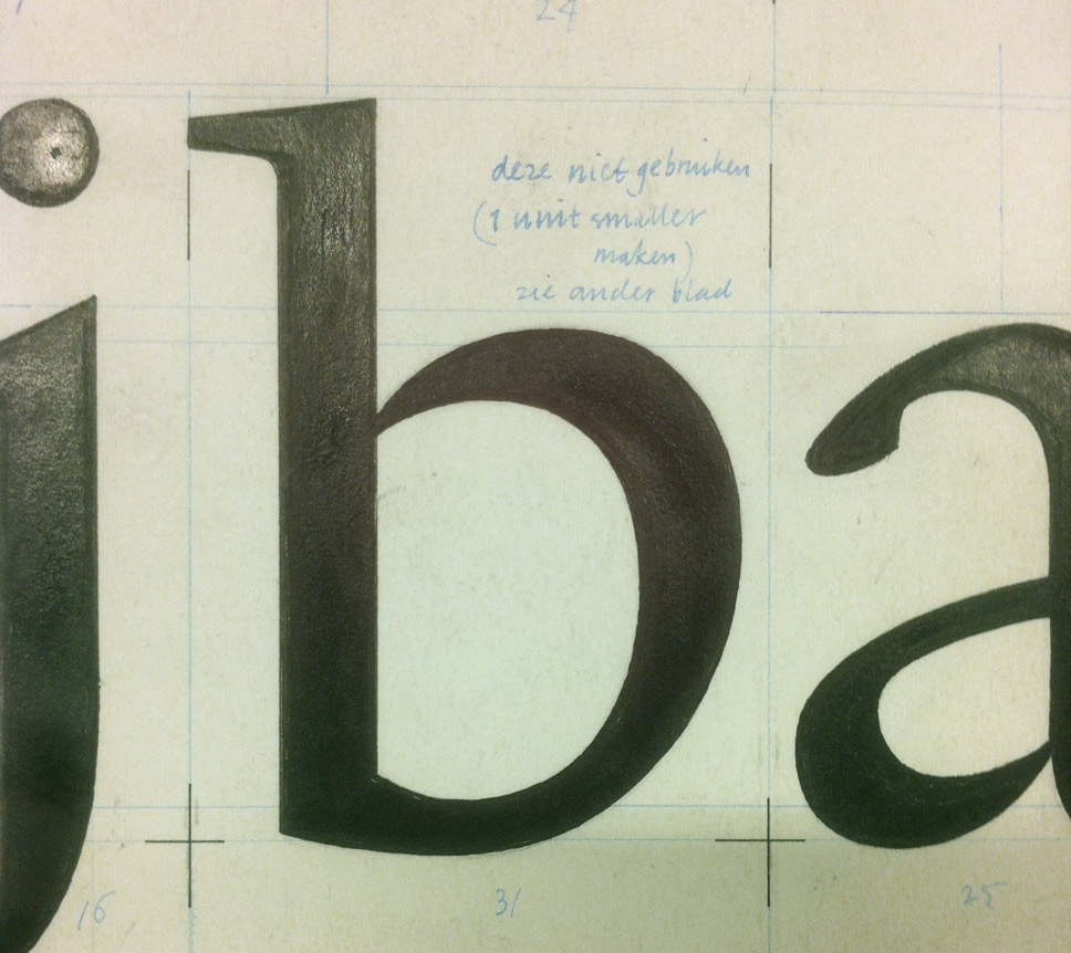
“Do not use this (make 1 unit narrower)”. From Bram de Does’ drawings for Lexicon
Toshi Omagari hovering over exhibits too
And now he will forever be hovertoshi for my visual brain. Thanks for the nice flash back of some great moments. Wonderful conference indeed.
For those of us who couldn’t be there, testimonials like this are very welcome! I appreciate how you give honest praise without fawning, as well as criticism without harshness. Allow me to try to adopt that spirit myself… :-)
Even though I myself disagree with most “libre types” (nice play on words BTW) on some key points, I think we have to admit that it’s now integral to the “type scene proper” – it’s not really us against them. Considering the number of reputable type designers (such as Paul and Miguel at Adobe) producing quality libre fonts, I think one can be allowed to harbor hope that libre type design can contribute positive things.
Concerning Nick Sherman’s idea of deploying interpolated fonts for dynamic/parametric typography, I personally love that sort of thing… but I actually didn’t think you would! Maybe the promise of elegance and efficiency is over-powering your distrust of what might seem to be an anti-craft “easy way out”. BTW to me MM-style outline interpolation is much more promising than the utopian “expanded skeleton” approach; yes, it’s about twice the data, but give so much more control, hence quality. And just look at Computer Modern…
Lastly, about the TypeCrit: indeed I hope as well that it keeps going. One question is whether it needs to be differentiated from the long-standing TypeCon effort, and if so, how. Concerning this last bit, the presence of Gerry on the panel might be a promising clue, if you get my non-Latin drift… (Man, I’m using a lot of ellipses… Doh!)
BTW, I would love to be able to see Petr’s talk. Are video proceedings in the pipeline? Pretty please with diacritics on top?
Hrant, I should specify that when I likened Nick’s idea to Metafont rather than MM, I did not mean adopting a pen model to generate outlines; what I was meaning to refer to was the idea of having a fully parameter-based “design template” in which variables can be fed different values to dynamically generate different variants, rather than just using variables to control interpolation between existing (“drawn”) variants.
(Is this clear? My head is a little fuzzy today.)
Nina, thanks for the elaboration – that makes a world of difference (at least to me). In fact what you describe is the tantalizing “next level”. As I’ve said now and again: parametric type design is to type design what type design is to lettering.
The thing is, using parameters to control the outlines (independent of a “skeleton”) is also extremely rare. I only know of a single case: http://typophile.com/node/73827 (Note that Typophile is currently down… again). Probably for two reasons: too many people –in fact including Knuth himself– associate parametrization with strokes; and it’s qualitatively much harder! But one fine day it will serve to separate the women from the girls, so to speak. And Nick’s proposal could only accelerate that.
Hrant, I believe the videos will be available to all ATypI members, and a few will be published – maybe Petr’s keynote :)
Pingback: Nina Stössinger on Libre Fonts panel at ATypI