Turns out people weren’t making stuff up when they said it would be busy at TypeMedia. :)
We have by now pretty much reached the halftime point (which baffles the mind, but that’s another story), and there is a little bit of time to breathe and write a few words. The first semester is over, we’ve presented and/or handed in all assignments so far (obligatory Asterix reference: all assignments? – no! One presentation is still coming up later this week). The mode in which most of the first-semester work was presented was to stick it all up on the wall for the teachers to examine and critique; sketches (paper and digital), attempts at writing with various tools, stonecarving*, programming experiments, a Greek companion to a Latin typeface, a broad-nib-based low-/normal-/high-contrast family, and a revival of a cold-metal typeface. Seeing all this work cover the walls of our nerdcave was… impressive. (»Man weiß auf jeden Fall, dass man was gemacht hat.«)
(* My classmate David literally stuck his stones up on the wall. They survived two falls.)
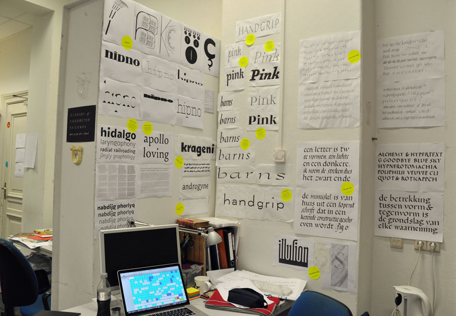
My desk with about two-thirds of my wall space for presentation week.
The first-semester project I am most excited about (although this is a really close call with the Python and the stonecarving) was the revival. When looking for a book with an interesting typeface to revive I had come across one that looked vaguely like Fleischman, but a bit more old-style, softer and less sparkly, with lower contrast. After a bit of research, the typeface turned out to be indeed by Fleischman, but/and one of his earliest ones – cut in his first three years in the Netherlands, when he was between 22 and 25 years old. I loved working on this; it taught me tons not just about design but also about how to structure and document such a process. Also, a great excuse to learn more about Fleischman, punchcutting, and Dutch foundries in the 18th century.
Michiel, my revival of Fleischman’s 1730–1732 Mediaan for Uytwerf.
I’ve probably said this before, but I can tell that I’m learning tons – I’m growing, in what I can draw, in what I want to draw, in what I see. The different tools and media and approaches and questions of the first semester have all given me new perspectives on lettershapes.
One thing that’s very much under construction is that I now find the type I made pre-TypeMedia tends to be static, and kind of cold. Probably a combination of my Swiss background, preference for simple shapes, and propensity for working directly in a digital environment. And the fact that I like to be in control and I’m tense. (That’s what Françoise sees, my amazing stonecarving teacher. She sees it in my writing, too. I know she’s right.)
It’s not like I think all that is fundamentally wrong (well, except the tenseness maybe). I like (seemingly) simple designs over complicated and ornate ones, and I’m not a fan of type that is overly imitative of writing. But one thing I’m trying to absorb from all this Dutchness around me is to get a little more life into the lines I draw. I’m still exploring what exactly that means, but sketching seems to help (as it does overall with contrast, rhythm, proportion, spacing etcetera).
And sketching will be filling most of my waking life in the coming weeks, apparently. I’m excited to be starting out with the final project, looking ahead at weeks of playtime. (Bear with me: I won’t share for a while what I’m working on; it’s still a very fragile little plant.)
“Go explore the designspace” they said. FOR A MONTH. I can’t even remember the last time I had this much time to play, and explore, and try out things, and fail, and try out tools, and ideas, and navigate the designspace and have enough time to sail really far out. I’m telling you, TypeMedia is some elaborate typographic form of paradise.