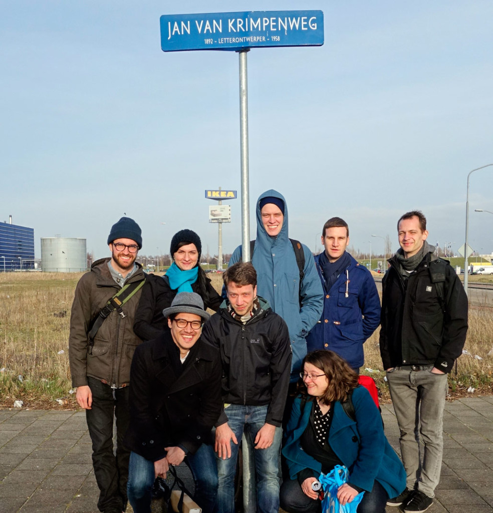
Back row, left to right: Alexandre, Slávka, James, Hugo, David; front row: Mark, Mark, me – we were staring into the setting sun, and this is about two seconds after I gave up. Photo taken by Jan Willem Stas.
I’m not going to apologize again for not posting more, mostly because I don’t like feeling like a broken record, and jump right into a story I’ve been wanting to tell: That of our excursion to Museum Enschedé in Haarlem, the archive of Joh. Enschedé en Zonen, printing business and focus point of the rich history of Dutch typefounding.
The roots of Enschedé reach back into the very matter I was researching earlier this (academic) year in my revival project: The typefoundry that Johann Michael Fleischman started in Amsterdam but soon gave up again (he was, endearingly, a great punchcutter but a lousy businessman) was taken over by a certain Rudolph Wetstein from Basel and later sold, among other material, to Joh. I Enschedé; that marked the beginning of their typefounding activities in 1743. The foundry grew quickly and sold the work of great Dutch punchcutters for centuries: besides Fleischman (who returned to cut the bulk of his work for them), names like Van Dijck, Kis, Rosart, later Van Krimpen and De Does come to mind.
This design legacy is carried on today by the Enschedé Font Foundry; but the company archive is in the basement of Joh. Enschedé en Zonen, which now focuses on specialized security printing for stamps and banknotes. This means that the building is highly secured, visiting it is kind of a big deal, and cameras are not allowed inside. While the lack of visual documentation is sad, not having a lens in front of my face also made the experience deeper.
So in early March, we traveled to a heavily secured and otherwise nondescript factory building in an industrial zone in the outskirts of Haarlem, where rabbits run on deserted lawns behind an IKEA just off a major road. It felt pretty anticlimactic until we had met the curator, Johan de Zoete, traveled into the basement of the complex, and crossed the threshold into his treasure chamber. There it felt as if time itself was holding its breath. Breaking down, laying bare its contents for us to see. Letters from centuries. Rows and rows of books, journals, boxes with letters and objects. Posters and prints hung framed on the walls. We were told to stay together, to not touch anything. We behaved, but I wanted to touch everything. I wanted to live there.
We wandered through the centuries, and Mr de Zoete told us stories, showed photo albums, Daguerreotypes and paintings, bibles and books. And type. Type that showed off the limits of what Enschedé’s master craftsmen could do: beautifully floriated Didot capitals with hair-thin lines; a four-point bible type whose metal was thin and brittle and the letter faces barely visible even through a magnifying glass. We shuddered to think how long that would take to typeset … We turned a corner, and there was Paul Rädisch’s workbench: It looked as though Jan van Krimpen’s punchcutter had just gone out for coffee, “look, everything is the same”, said Mr de Zoete, pointing to a photograph of Rädisch sitting at that same desk, all the tools in the same arrangement, “only the candle has burned down a little more” he said, insisting it was the same one.
History really comes into life and into context when it can be experienced like this. For instance Fleischman’s famous music type: I had known it existed, I had seen samples, but now it was lying there, in use in a violin manual by Leopold Mozart. (The father of W. A. Mozart; I’ve loved the famous son’s work since my childhood piano-playing days.) Realizing that that had then been a contemporary use … it was odd; type ages so slowly, and I easily forget how old it is, that Fleischman died when W. A. Mozart was twelve. I stood lost in thought, and Fleischman looked out from a tiny painting in which he looked wise and less ugly than in the well-known engraving (I remember thinking he looked a bit like Kevin Spacey). Around the painting were displayed his punchcutting tools, and I wished I could deduce something more meaningful from staring at these than “omg Fleischman worked with these 250 years ago”, but even that was pretty impressive.
I could talk about banknotes, envelopes, vignettes, furniture and stamps and books, but I will just mention one more amazing thing: Smoke proofs. I had read that punchcutters, while working on a punch, would take smoke proofs to judge their work; this involved blackening the punch over a flame (hence the candle on Rädisch’s desk) and pressing it – perfectly vertical, aligned to a guide – onto a sheet of paper, where the soot would leave an impression. It’s a quick way to “preview” a lettershape in progress, but what I did not know was that this is probably the sharpest reproduction one can get of type; and that it keeps. We got to see some of Rädisch’s decades-old smoke proofs of one of Jan van Krimpen’s faces. The soot stood black on the page, perfectly black, perfectly sharp. I held my breath, again.
We bought books. We said goodbye, and on our way home took the above photo, staring into the evening sun. Then we carried our books to the train, and slowly returned to the year 2014.