
tone is a beautiful thing.
When I was 17 or so I wanted to study geology. Granted, there have been lots of things I’ve wanted to study. But I can still feel the fascination I had with rocks, tectonics, the formation of mountains. There’s something deeply beautiful about realizing that they move – that everything moves, even mountains, those symbols of eternal stasis. On time scales where our entire existence is just a blip, rocks flow, oceans rise, mountains fold. To understand how these processes work, how they’ve shaped our surroundings! To pick up a rock and be able to tell how it fits into the overall scheme, and where in the chain of events it was produced, millions of years ago…
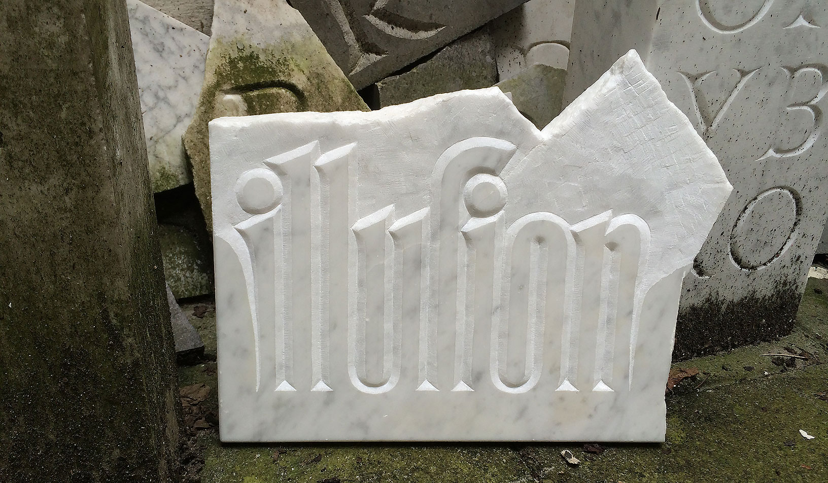
My final stonecarving piece for TypeMedia 1314
Perhaps not surprisingly, learning to carve letters in stone from Françoise Berserik was one of my favorite new discoveries during my year at TypeMedia. Soon after graduating, I decided to get my own tools and continue on – and Françoise kindly invited me to join her classes again with the following TypeMedia year. I’m very grateful for this, and I’m enjoying taking breaks from my digital work here and there to spend a few hours practicing this craft. It’s very analogue, and pretty slow, and requires a lot of focus, of being-in-the-moment.
![Carving with t]m 1415](http://blog.ninastoessinger.com/wp-content/uploads/2015/01/IMG_7997.jpg)
Carving with TypeMedia 1415
Cutting into the stone is a rather dramatic effect; it presents a different view of the material, exposes it to the light that plays on it along the shapes you’re making. Carving is very much a dialogue with the stone: It’s hard to imagine interacting more deeply with a material. You learn about stone from a new angle: Does it break easily? What is its structure like? How well does it hold detail? Does it easily absorb power, or do you need to be gentle? Different types of rock react differently, and not all designs work in all kinds of stone.
A nice thing to realize is that just like mountains aren’t static, stone is not actually all that hard. At least it doesn’t feel like it when you carve. If you work with a sharp chisel, some stone can feel like butter that’s been in the freezer, or like clay, or like soap. (In my mind / muscle memory, white marble feels creamy, with occasional crunchy bits. Of course that’s creaminess on a much slower scale.) Stone is not just hard as stone, then; there are also very different ways hardness can manifest itself – stone can be tough, dense, crystalline or brittle, or a bunch of different adjectives that probably don’t even exist.
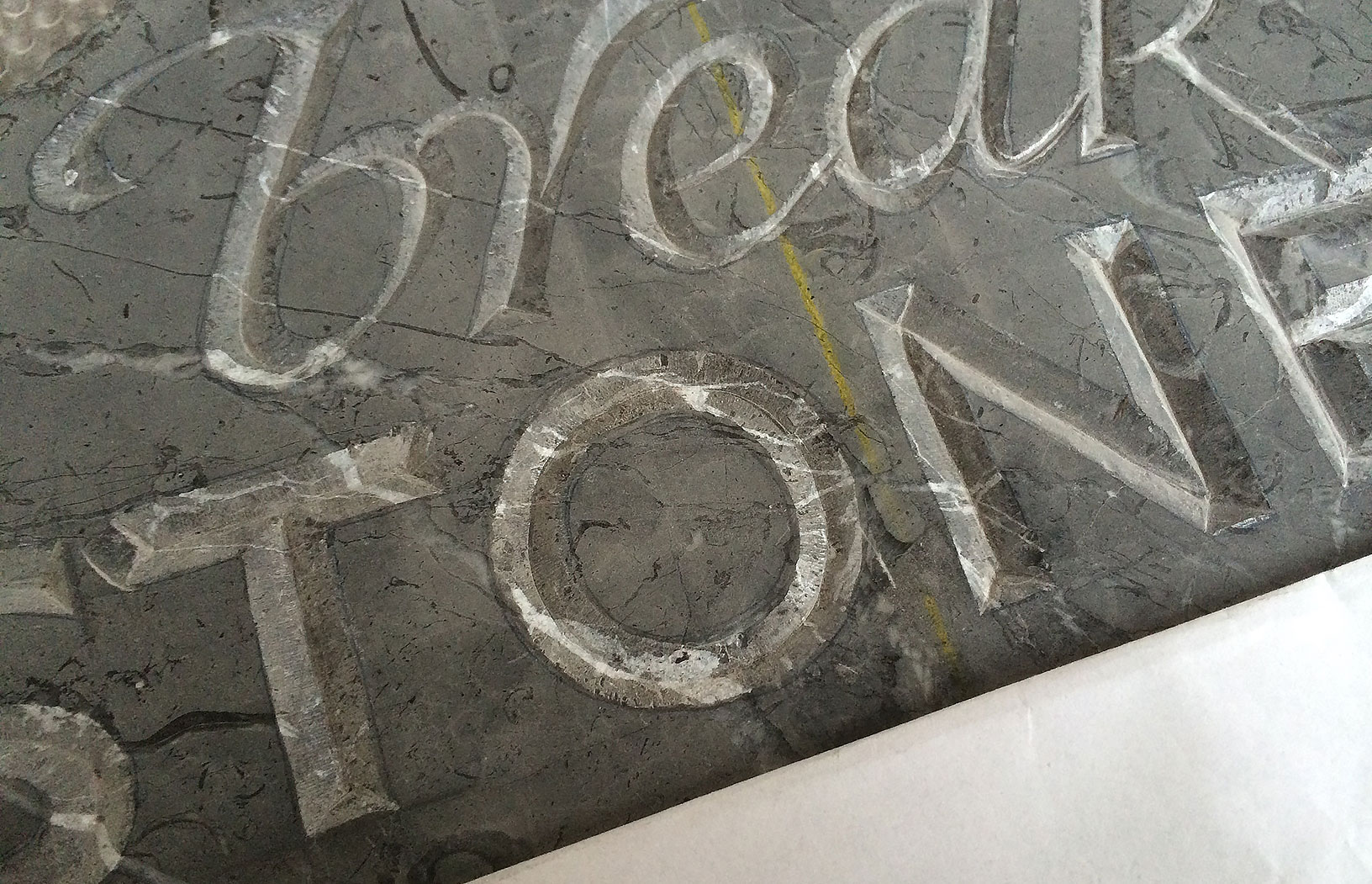
Cutting this O into grey marble I’ve been enjoying the rather dramatic patterning inside. The veins, in this case, are also quite a bit harder than the surrounding grey stone. (Very much a work in progress.)
Stonecarving, or carving letters in stone (for which the Dutch have a concise, if not exactly poetic term: letterhakken), also offers a very different perspective on letterforms: One which includes a third dimension, that changes with light and shade. If you cut letters with a classic V-cut, one of the most prominent features is the center line, where the two diagonal cuts meet at the bottom of the letter. This has to be considered in the drawing. For instance, for the current piece pictured above I figured I needed to redraw the N so that the joins would work, that the center line would be continuous (it’s not perfect… I know). That’s an entirely different approach than drawing an N for a print typeface, where a midline is imaginary at best and you’ll probably want to compensate and cheat to make the joins look less dark.
I still consider myself pretty much a beginner, so these notes need to be read as early things I’m learning. I can tell though that I’m slowly getting a bit more confident, a bit more practised, getting a better understanding of how the material works. That’s a nice feeling. Although “of course you should never think that”, as Françoise told me last week; for just when I was thinking that this was all beginning to feel a bit more manageable, a big piece of stone chipped off the corner of a ‘T’… so much for focus. Mostly, though, carving is not as worryingly delicate as I originally feared, at least not during the entire process. Sure, there is no Undo, but carving is an iterative way of building letterforms – which to me seems so much less scary than having to make letters in one go, as in calligraphy. You’re building a letter slowly, from the inside out; many mistakes or imprecisions can be fixed as you go ahead, tap for tap.
I do hope I can go on learning and practicing letterhakken for many years. It’s not a very practical hobby to have – it’s noisy and dusty and you have to carry heavy things around – but it’s a beautiful craft to learn, and I would very much recommend it to people who like letters and craft and, perhaps, stone. It requires patience, yes. But what technique, relating to letters, does not?
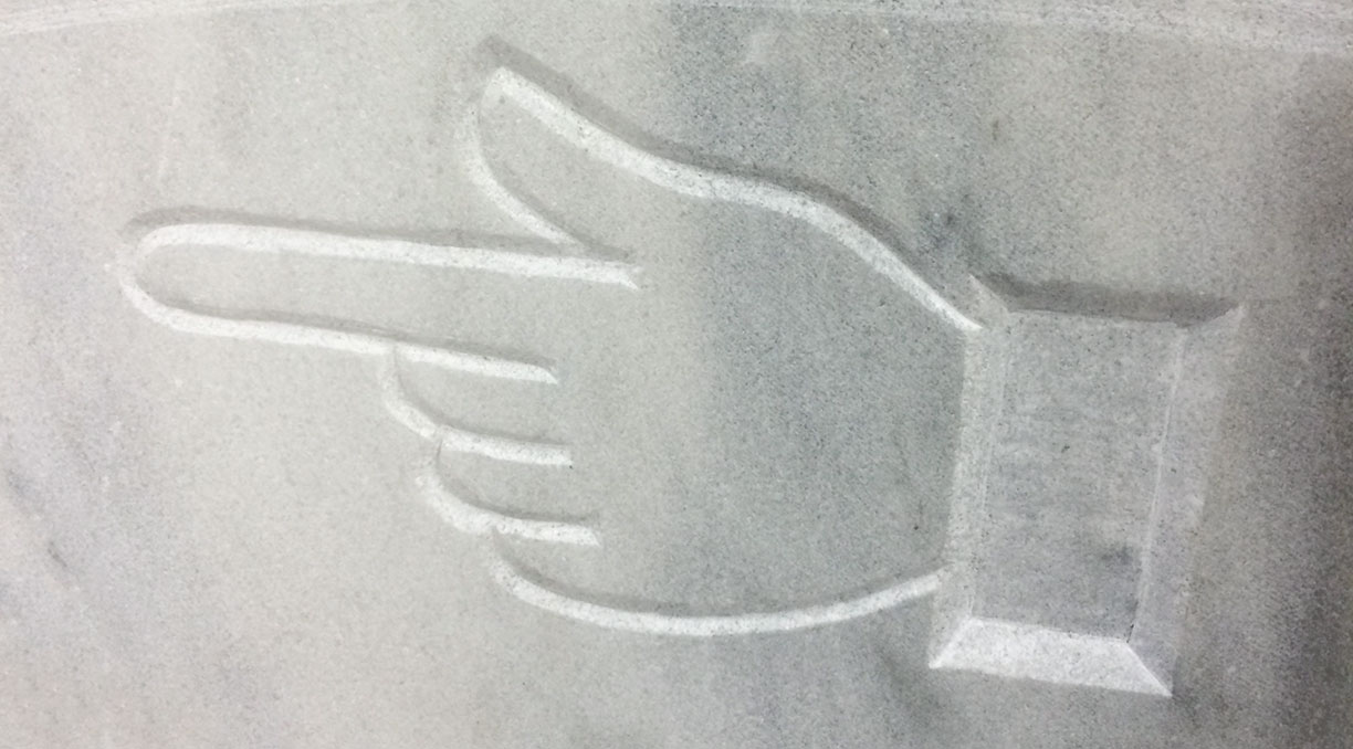
Manicule in white marble
Hi Nina! Nice post, great to read from your point of view, where you’re familiar with it but still getting a hang of stone carving. Can’t wait to try it myself some day, it seems equal parts challenging and fun!
Your post reminded me of a great novel that came out late 2013 called “A Perfect Capital”, about a Unitedstatsian letter carver who moves to London to inspect Gill’s work and to create her own magnum opus. I think you’d really enjoy it!
Best,
Álvaro Franca
Pingback: I Love Typography » Blog Archive This Month in Typography — I Love Typography
Pingback: Entramos en una imprenta 2015 - Enlaces · Artysmedia