Author Archives: nina

Books of 2019

Two years ago, I decided to go back to reading books. Like many friends, I was a voracious reader once, then gradually dropped the habit between being Online and being Busy. I missed it though, curling up in bed with a more or less well-designed block of printed paper that doesn’t tell me if I have email, and immersing myself in someone else’s brainspace.

It was a New Year’s resolution that stuck. I read 19 books in 2018; and now after 2019, I feel like a proper reader again, with 46 books read this past year, and a need for a new bookcase too. (I was on track for a book a week at some point but then decided to attack two 1000-page brick-shaped objects—Infinite Jest and Ducks, Newburyport—which took me about a month each.)

So! Here are my Books of 2019, with a few notes. The ones in bold are the ones that spoke to me the most. The dagger † is for nonfiction, double dagger ‡ means German (everything else was read in English).

  1. Belinda McKeon: Solace
  2. Bryan Stevenson: Just Mercy†
    I found this in a Little Free Library in my neighborhood and am so glad I picked it up—important and impressive, on Stevenson’s work defending wrongfully convicted Death Row inmates. The new movie is powerful too.
  3. Michelle Obama: Becoming†
  4. Peter Bichsel: Zur Stadt Paris‡
  5. Christa Wolf: Nachruf auf Lebende‡
  6. Chimamanda Ngozi Adichie: Dear Ijeawele, or a Feminist Manifesto in Fifteen Suggestions†
  7. Sarah Moss: Ghost Wall
    Odd and haunting. Couldn’t stop thinking about this for a while.
  8. Sarah Moss: Night Waking
  9. Colson Whitehead: The Intuitionist
  10. Jennifer Egan: Manhattan Beach
    I mostly enjoyed this for the precise and well-researched (it seems) descriptions of 1940s Brooklyn.
  11. Sandra Newman: The Heavens
  12. Tommy Orange: There There
    This was great, and illuminating as a new (to me) perspective (young, urban Native).
  13. Margaret Atwood: The Handmaid’s Tale
    YES what took me so long! (I so didn’t want this to end that I attempted to watch the series after; but I prefer the book)
  14. Erling Kagge: Silence in the Age of Noise†
    Found this silly and self-important. If it were longer I wouldn’t have finished it.
  15. Valeria Luiselli: Lost Children Archive
    Complex and intelligent and important.
  16. Rachel Kushner: The Mars Room
  17. Austin Kleon: Keep Going†
  18. Italo Calvino: Invisible Cities
  19. Christian Picciolini: White American Youth†
  20. Tamara Shopsin: Arbitrary Stupid Goal†
  21. Ray Bradbury: Fahrenheit 451
    YES what took me so long (2). I’m not sure why I hadn’t read this yet. I’m so glad I did.
  22. Roxane Gay: Hunger†
    This was as hard for me to read as it was impossible to put down.
  23. Valeria Luiselli: Tell me How it Ends†
  24. Kressmann Taylor: Adressat unbekannt
  25. Ocean Vuong: On Earth We’re Briefly Gorgeous
  26. Rebecca Solnit: A Field Guide to Getting Lost†
  27. Emma Donoghue: Room
    Another book I found on the street and didn’t know what to expect of it and then totally got sucked into it. This is some good storytelling.
  28. Jerry Kelly & Misha Beletsky: The Noblest Roman†
    Look! Something about type! I should do more of these.
  29. Roxane Gay: Difficult Women
  30. Olivia Laing: The Lonely City†
    Not sure the concept of this quite worked for me, but I learned some things about NYC and artists who worked here, most importantly about David Wojnarowicz (whose big retrospective at the Whitney I had missed).
  31. CJ Hauser: Family of Origin
  32. Sarah Schulman: The Gentrification of the Mind†
    A super interesting (angry) perspective on the transformation of NYC starting in the early 1980s, with the AIDS crisis and the onset of gentrification. Quoted in “The Lonely City” above.
  33. Colson Whitehead: The Nickel Boys
  34. Toni Morrison: Beloved
  35. Colin Woodard: American Nations†
    A proposal to read the history of the United States as the history of eleven distinct regional cultures. Illuminating and eye-opening in many ways (thanks to Tobias for the recommendation).
  36. James Baldwin: The Fire Next Time†
  37. James Baldwin: Another Country
    YES what took me so long! (3) What a treat to finally fall into Baldwin. This was incredibly intense.
  38. David Foster Wallace: Infinite Jest
    I want to take a 2- or 3-week vacation and do nothing but reread this book, taking notes and tracing all the bits I’ve missed this time. But wow, man. I like his thinking, and his language.
  39. Thomas Pynchon: The Crying of Lot 49
    Wow ok that was a trip. I get what he’s doing, but I still find it frustrating. I am curious about Gravity’s Rainbow, but after this I’m not sure it’s for me.
  40. Joseph Heller: Catch-22
  41. Margaret Atwood: The Testaments
  42. Wolfgang Langhoff: Die Moorsoldaten†‡
    Haunting first-person account of early concentration camp life, published in the 1930s!!
  43. Anna Burns: Milkman
  44. Anonymous: A Warning
    Yeah that wasn’t really worth it.
  45. Thøger Jensen: Ludwig
  46. Lucy Ellman: Ducks, Newburyport
    ~1,000-page internal monologue. I get what she’s doing, and it works, but it was too long (surely intended, but still) and I also realized at some point that part of the reason why I read is to get away from the kind of anxious circular thought dump that this consists of.

Lots of great and worthwhile discoveries! That’s about 60% fiction; slightly more books by women—25—than by men; and roughly a third are books by writers of color. There are a few more that got abandoned; I only list books I finish. A dishonorable mention (I guess) goes to Kerouac’s On The Road, which I attempted to read for what must be the fourth or fifth time but it just doesn’t hold my interest, it just seems so bro-y, a story not told for me. Maybe next year. Or not. In any case, here’s to more reading in 2020!
On carving

S


tone is a beautiful thing.
When I was 17 or so I wanted to study geology. Granted, there have been lots of things I’ve wanted to study. But I can still feel the fascination I had with rocks, tectonics, the formation of mountains. There’s something deeply beautiful about realizing that they move – that everything moves, even mountains, those symbols of eternal stasis. On time scales where our entire existence is just a blip, rocks flow, oceans rise, mountains fold. To understand how these processes work, how they’ve shaped our surroundings! To pick up a rock and be able to tell how it fits into the overall scheme, and where in the chain of events it was produced, millions of years ago…

My final stonecarving piece for TypeMedia 1314

My final stonecarving piece for TypeMedia 1314

Perhaps not surprisingly, learning to carve letters in stone from Françoise Berserik was one of my favorite new discoveries during my year at TypeMedia. Soon after graduating, I decided to get my own tools and continue on – and Françoise kindly invited me to join her classes again with the following TypeMedia year. I’m very grateful for this, and I’m enjoying taking breaks from my digital work here and there to spend a few hours practicing this craft. It’s very analogue, and pretty slow, and requires a lot of focus, of being-in-the-moment.

Carving with t]m 1415

Carving with TypeMedia 1415

Cutting into the stone is a rather dramatic effect; it presents a different view of the material, exposes it to the light that plays on it along the shapes you’re making. Carving is very much a dialogue with the stone: It’s hard to imagine interacting more deeply with a material. You learn about stone from a new angle: Does it break easily? What is its structure like? How well does it hold detail? Does it easily absorb power, or do you need to be gentle? Different types of rock react differently, and not all designs work in all kinds of stone.
A nice thing to realize is that just like mountains aren’t static, stone is not actually all that hard. At least it doesn’t feel like it when you carve. If you work with a sharp chisel, some stone can feel like butter that’s been in the freezer, or like clay, or like soap. (In my mind / muscle memory, white marble feels creamy, with occasional crunchy bits. Of course that’s creaminess on a much slower scale.) Stone is not just hard as stone, then; there are also very different ways hardness can manifest itself – stone can be tough, dense, crystalline or brittle, or a bunch of different adjectives that probably don’t even exist.

IMG_8032

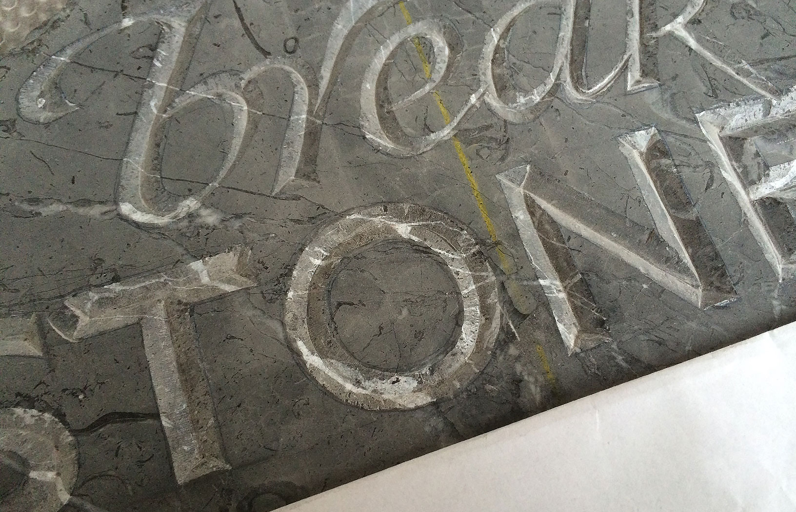
Cutting this O into grey marble I’ve been enjoying the rather dramatic patterning inside. The veins, in this case, are also quite a bit harder than the surrounding grey stone. (Very much a work in progress.)

Stonecarving, or carving letters in stone (for which the Dutch have a concise, if not exactly poetic term: letterhakken), also offers a very different perspective on letterforms: One which includes a third dimension, that changes with light and shade. If you cut letters with a classic V-cut, one of the most prominent features is the center line, where the two diagonal cuts meet at the bottom of the letter. This has to be considered in the drawing. For instance, for the current piece pictured above I figured I needed to redraw the N so that the joins would work, that the center line would be continuous (it’s not perfect… I know). That’s an entirely different approach than drawing an N for a print typeface, where a midline is imaginary at best and you’ll probably want to compensate and cheat to make the joins look less dark.

I still consider myself pretty much a beginner, so these notes need to be read as early things I’m learning. I can tell though that I’m slowly getting a bit more confident, a bit more practised, getting a better understanding of how the material works. That’s a nice feeling. Although “of course you should never think that”, as Françoise told me last week; for just when I was thinking that this was all beginning to feel a bit more manageable, a big piece of stone chipped off the corner of a ‘T’… so much for focus. Mostly, though, carving is not as worryingly delicate as I originally feared, at least not during the entire process. Sure, there is no Undo, but carving is an iterative way of building letterforms – which to me seems so much less scary than having to make letters in one go, as in calligraphy. You’re building a letter slowly, from the inside out; many mistakes or imprecisions can be fixed as you go ahead, tap for tap.

I do hope I can go on learning and practicing letterhakken for many years. It’s not a very practical hobby to have – it’s noisy and dusty and you have to carry heavy things around – but it’s a beautiful craft to learn, and I would very much recommend it to people who like letters and craft and, perhaps, stone. It requires patience, yes. But what technique, relating to letters, does not?

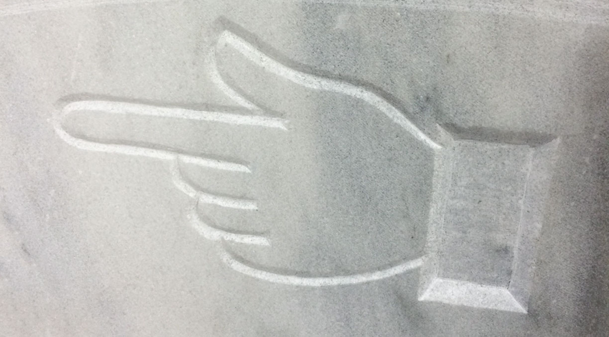
Manicule in white marble

Manicule in white marble

A little house by the sea

So TypeMedia is past, and I’m officially staying in the Netherlands.
No, I did not initially, necessarily, expect this. But Den Haag has been an amazingly welcoming place, and one that has often felt almost eerily tailored to qualities I generally like in cities (a size that is neither dizzyingly large nor inconveniently small; a mild, breezy climate; an active (but not overwhelming) cultural/design scene; proximity to the sea; brick buildings) and societies (sobriety, directness, consideration, practicality), and then it also has this incredible density of type designers and other nice people, some of whom I call friends.
So, yes, I like it here.

As of this month, I have moved out of the city center and am (in blatant fulfilment of one of my life goals – it feels early) living in a little house by myself which is about 200 meters away from the sea. In fact I think the width of the beach might be a hint greater than the distance from my house to the first bit of sand.

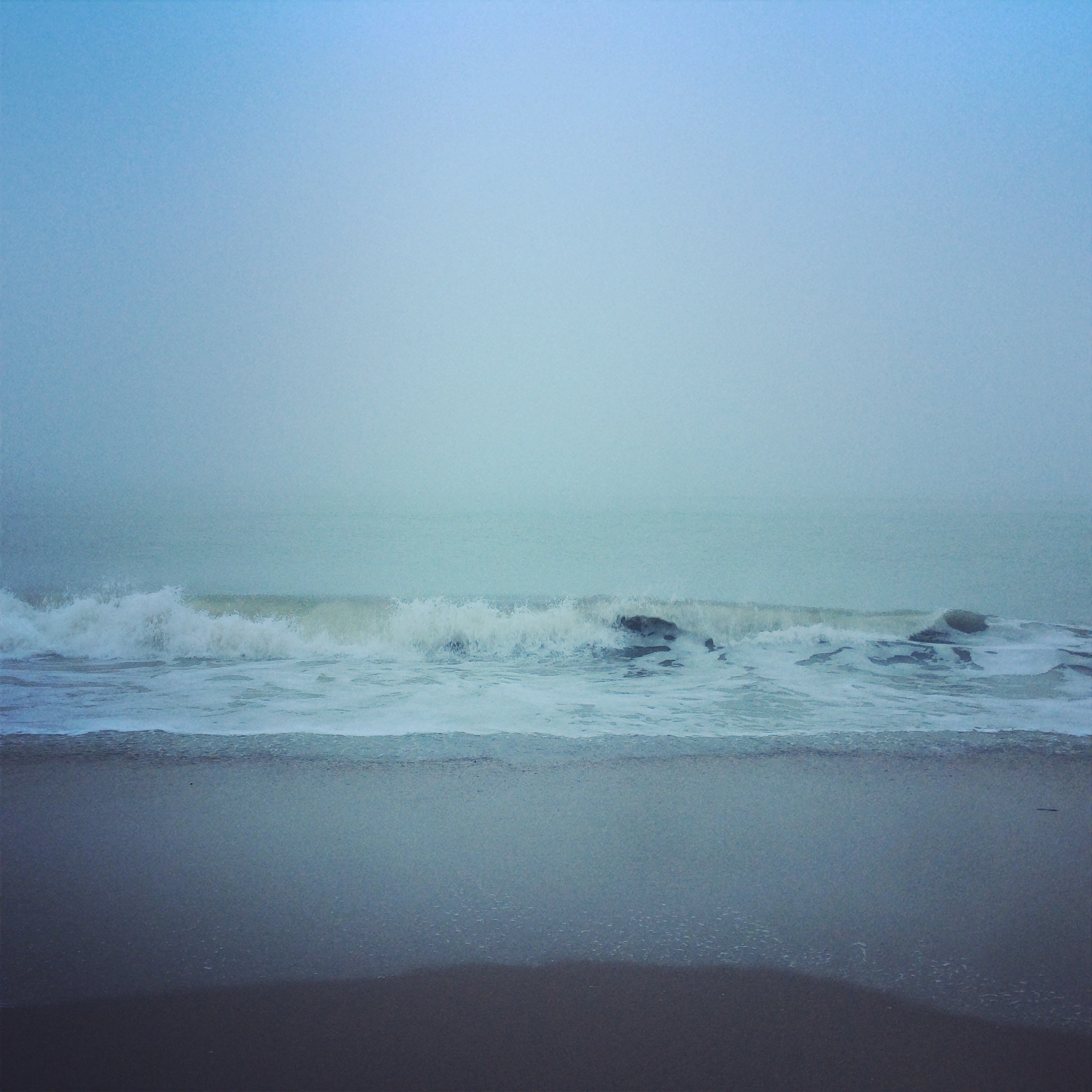
And so I am back in that state of always feeling like I’m actually on vacation, like I’m just pretending, just passing through… It’s hard for me, as a Swiss person who used to see the ocean – if I was lucky – once a year, to believe that anyone can just live so close to a beach, much less me. And see it every day. I see it every day now. In mist, in sun, in rain.

In a weird way, I am more “culture shocked” now than I was when I first came to Holland last year. Then it felt like a game: Let’s go live in this other country for a year! I was part of the adventure that was TypeMedia, and Holland was more or less coincidental, although I did like it.
Now, I’m 100% in Holland. I speak Dutch every day, I’m re-orienting myself in a new part of town that has almost none of my type friends, but neighbors and acquaintances from a Dutch world. It’s exciting, and beautiful, and a little bit scary. But there’s always the sea to stare at.

IMG_6211

Barcelona thunderstorm gif

gewitter

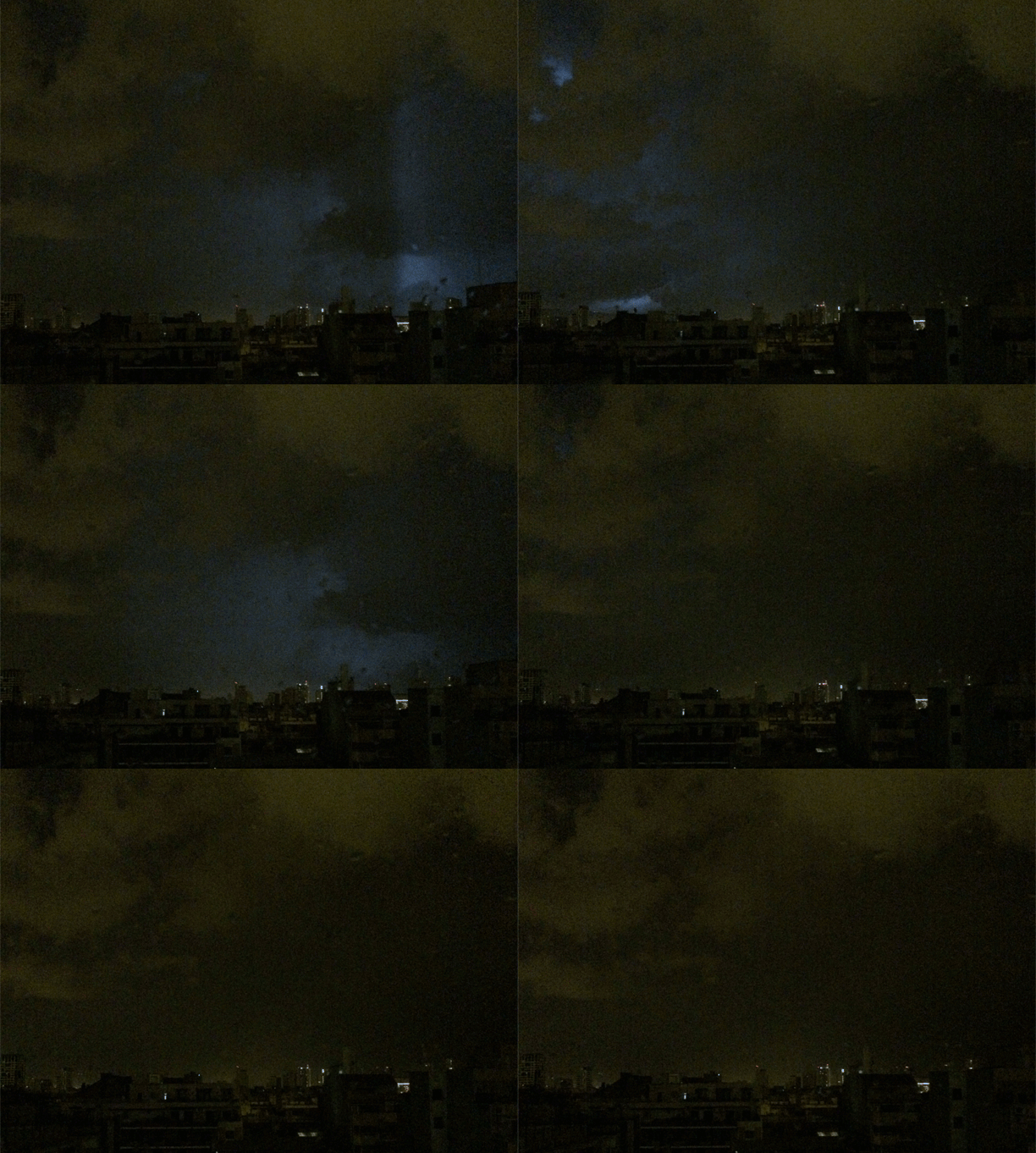
Not sure if anyone else finds thunderstorms as fascinating as I do, but here you go. In the night before the start of ATypI Barcelona, one of the most dramatic thunderstorms I’ve seen. This was pretty fantastic to watch, at least until after much such faraway, beautiful, almost-silent lightning suddenly thunder crashed down directly above and I was very, very awake for the next hour or so.

The above was made with the iPhone 5s “Burst Mode”, which is much more sensitive than recording a video. Next time I’ll try not to shake so much.

Post-industrial interlude

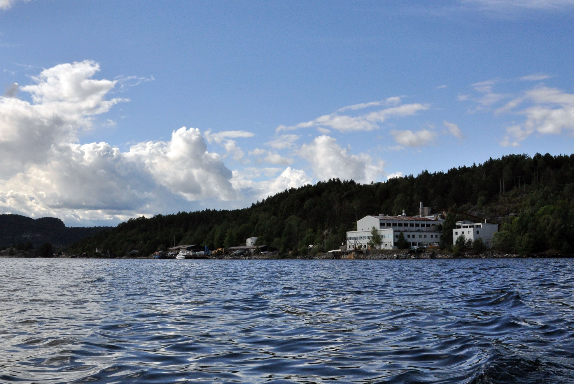
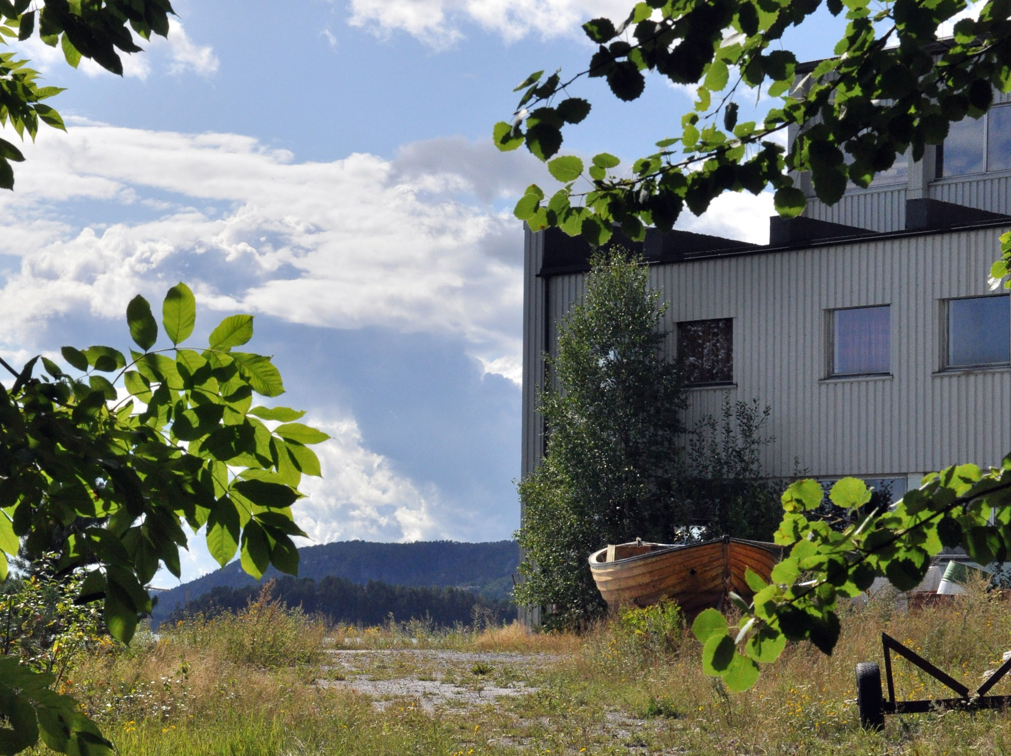
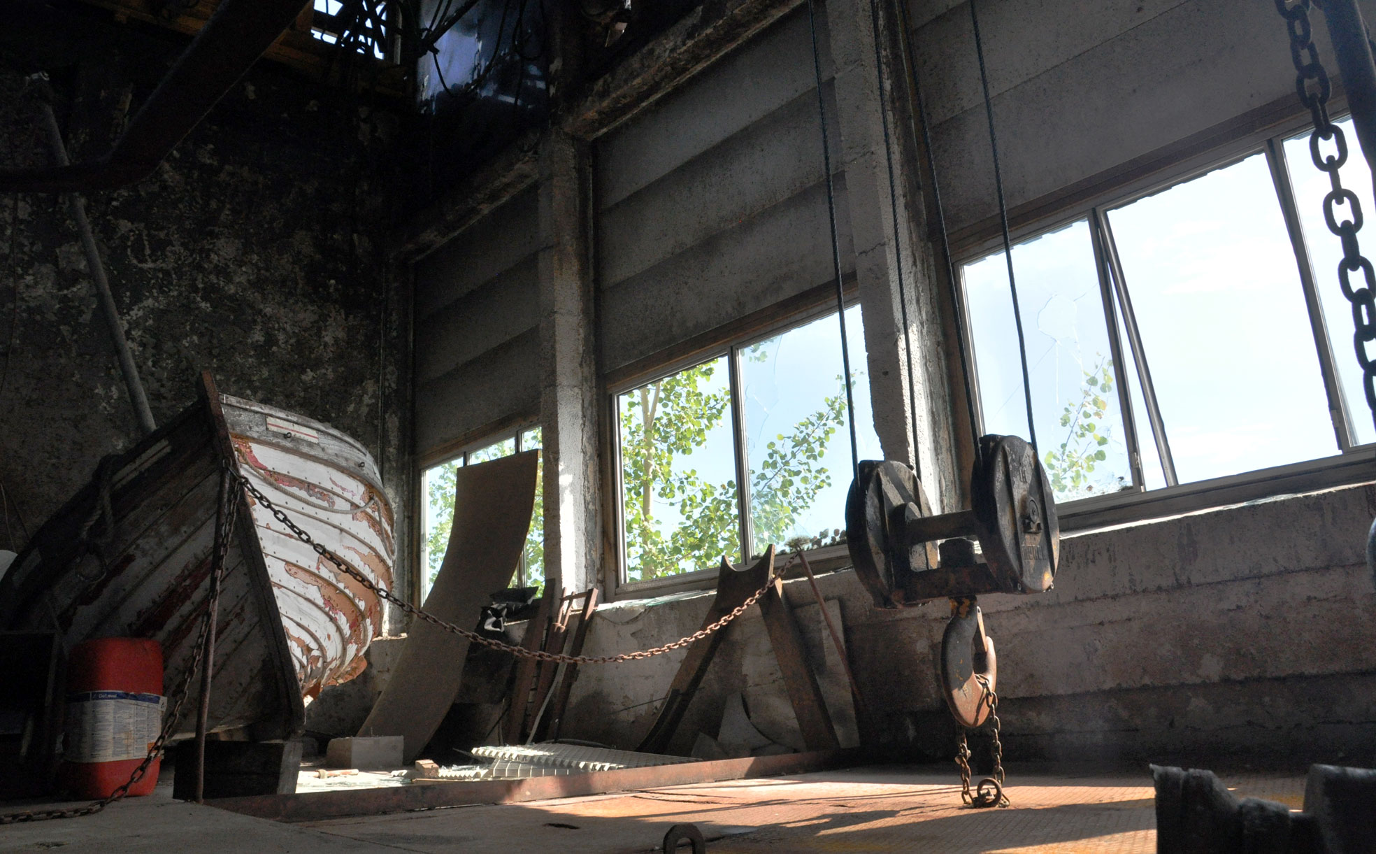
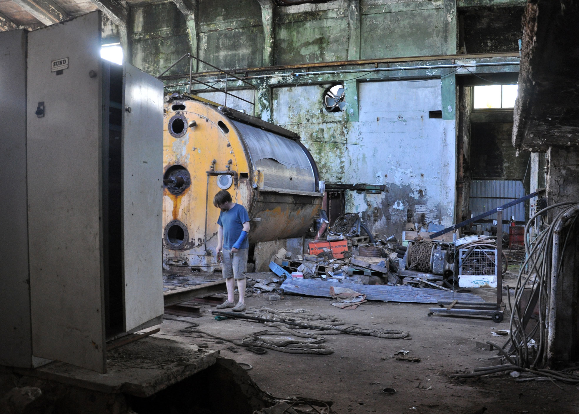
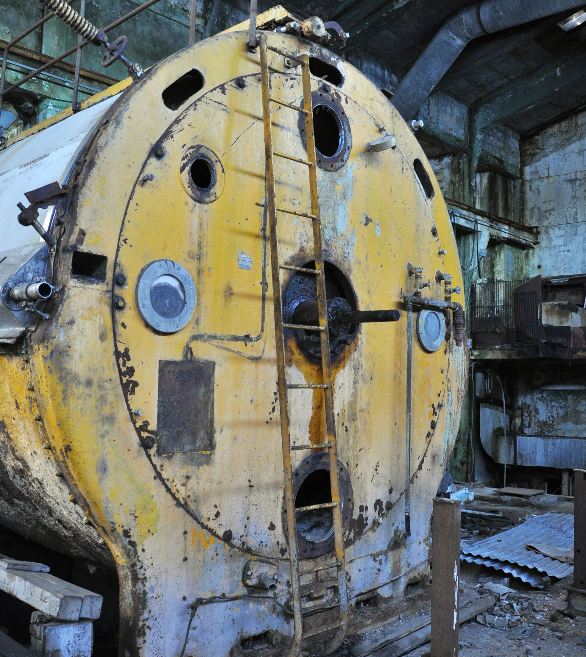
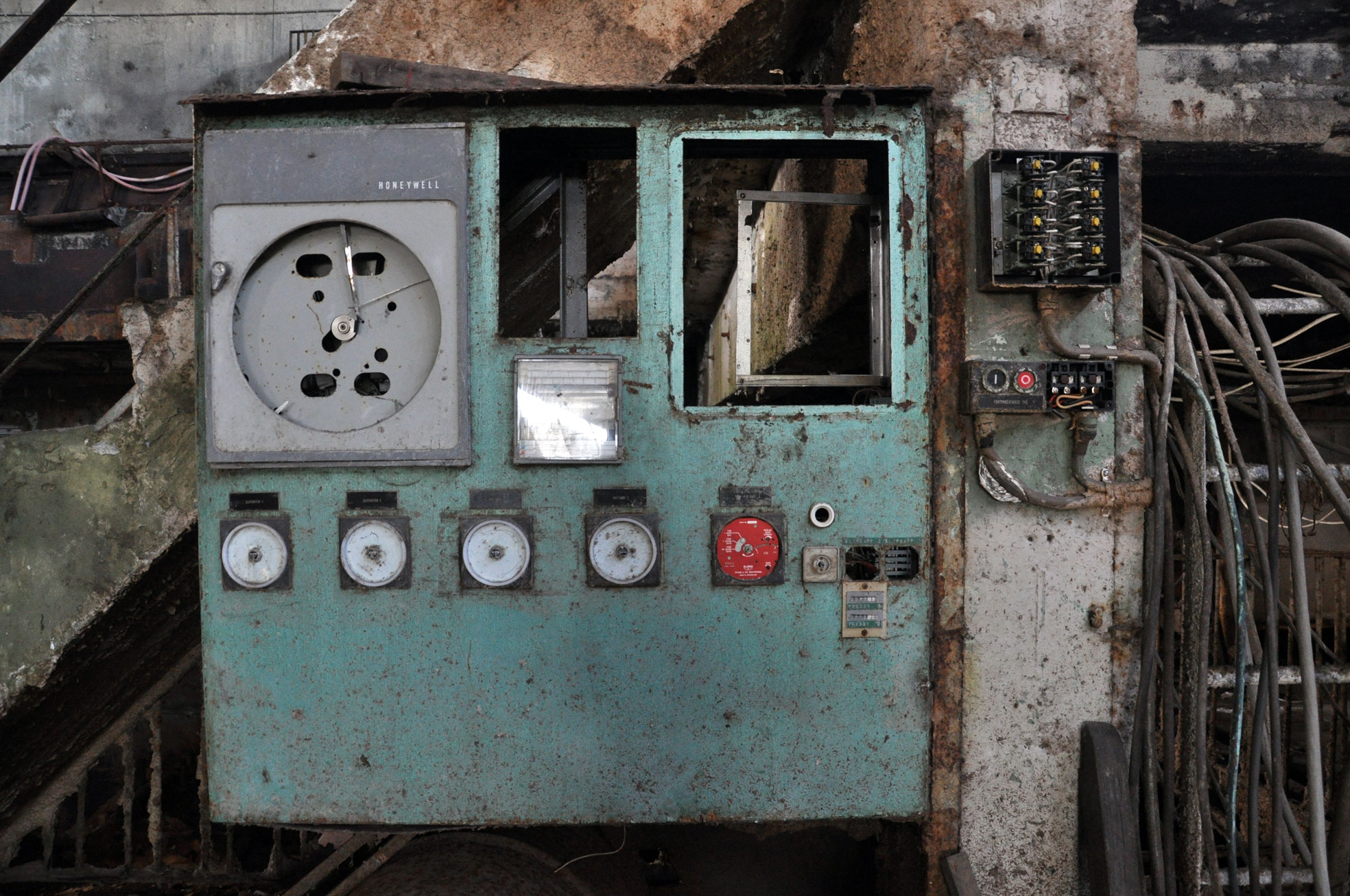
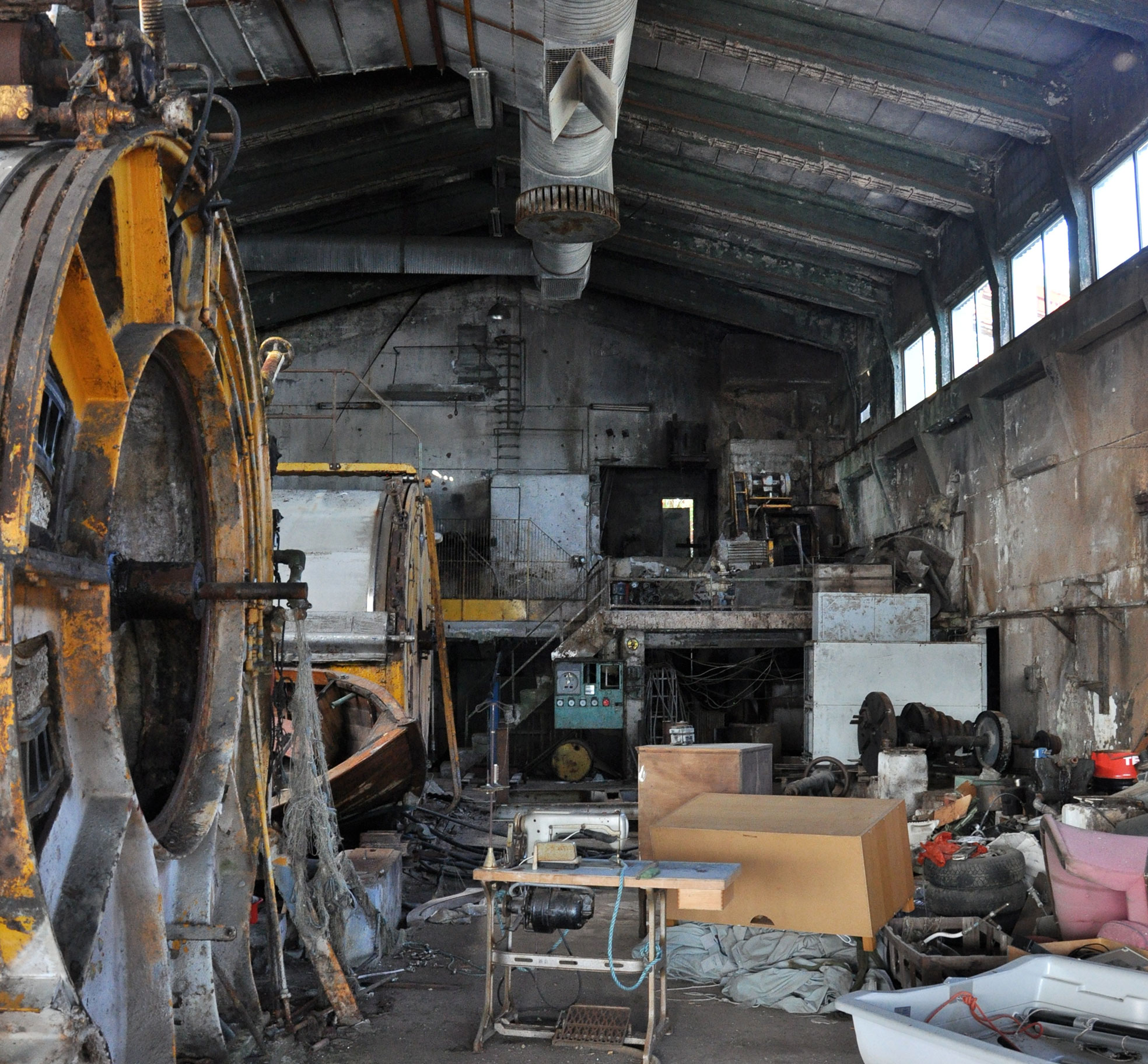
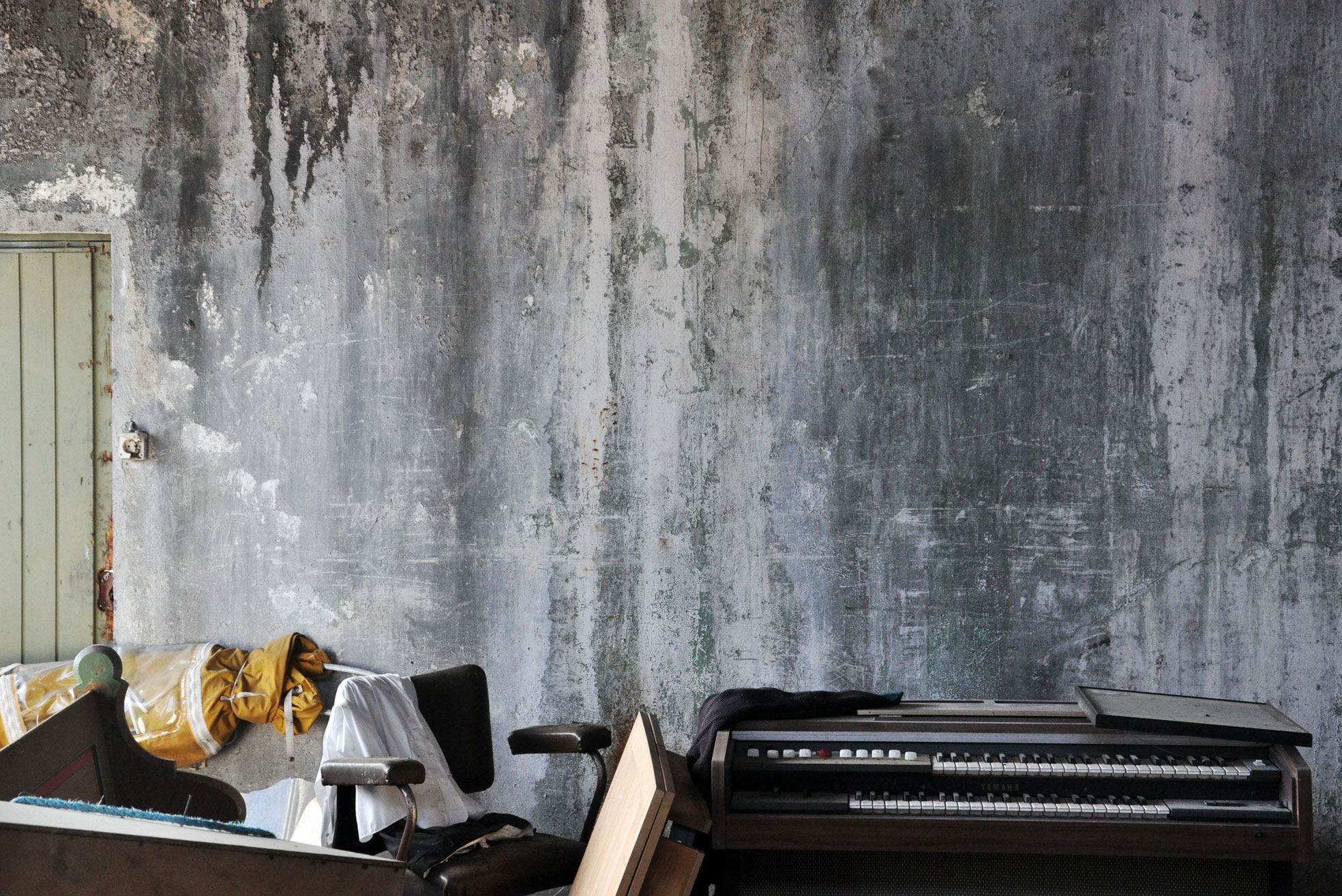
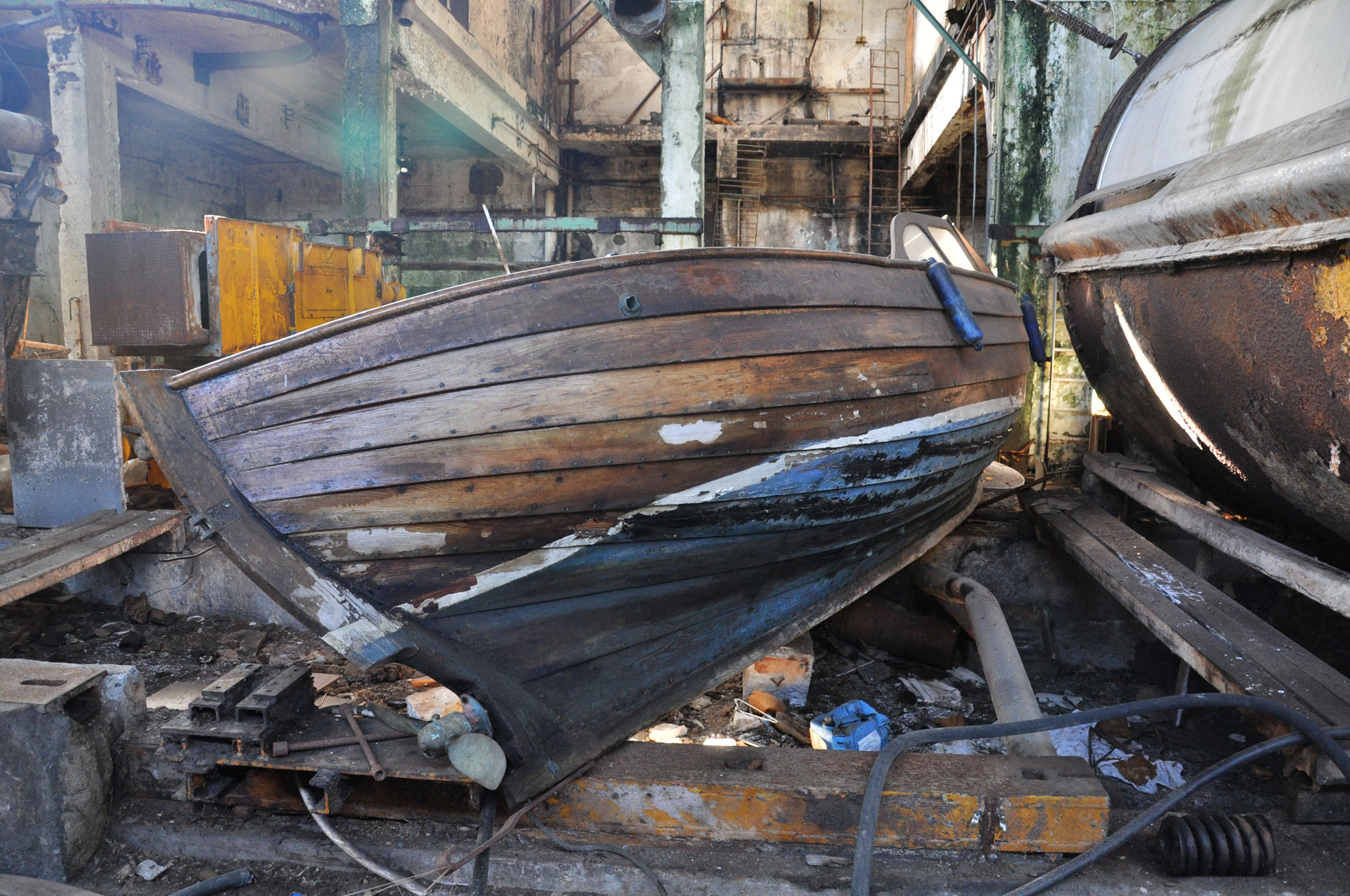
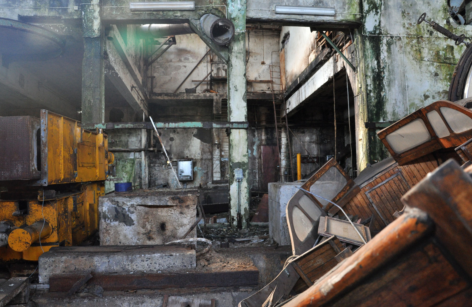
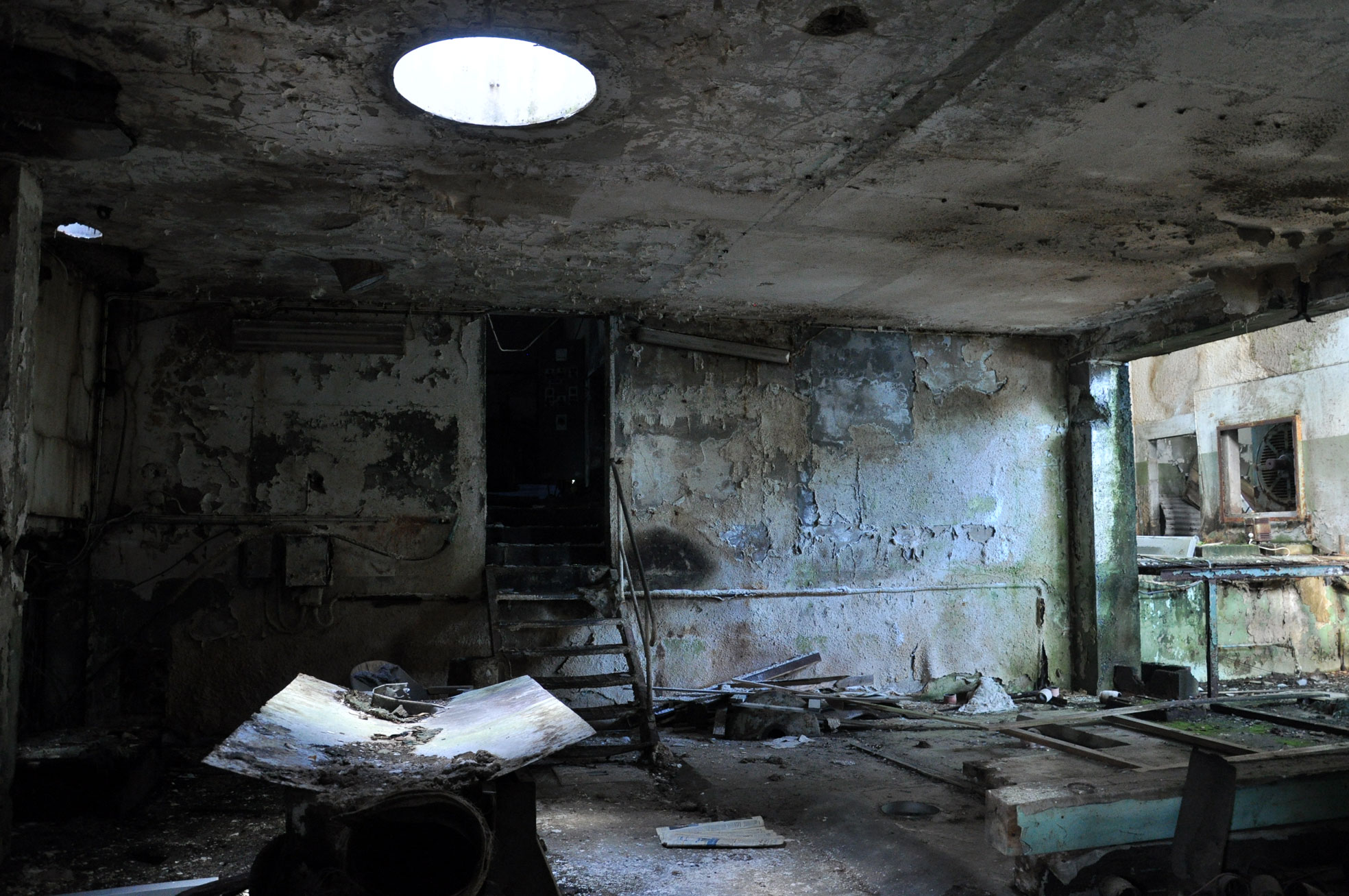
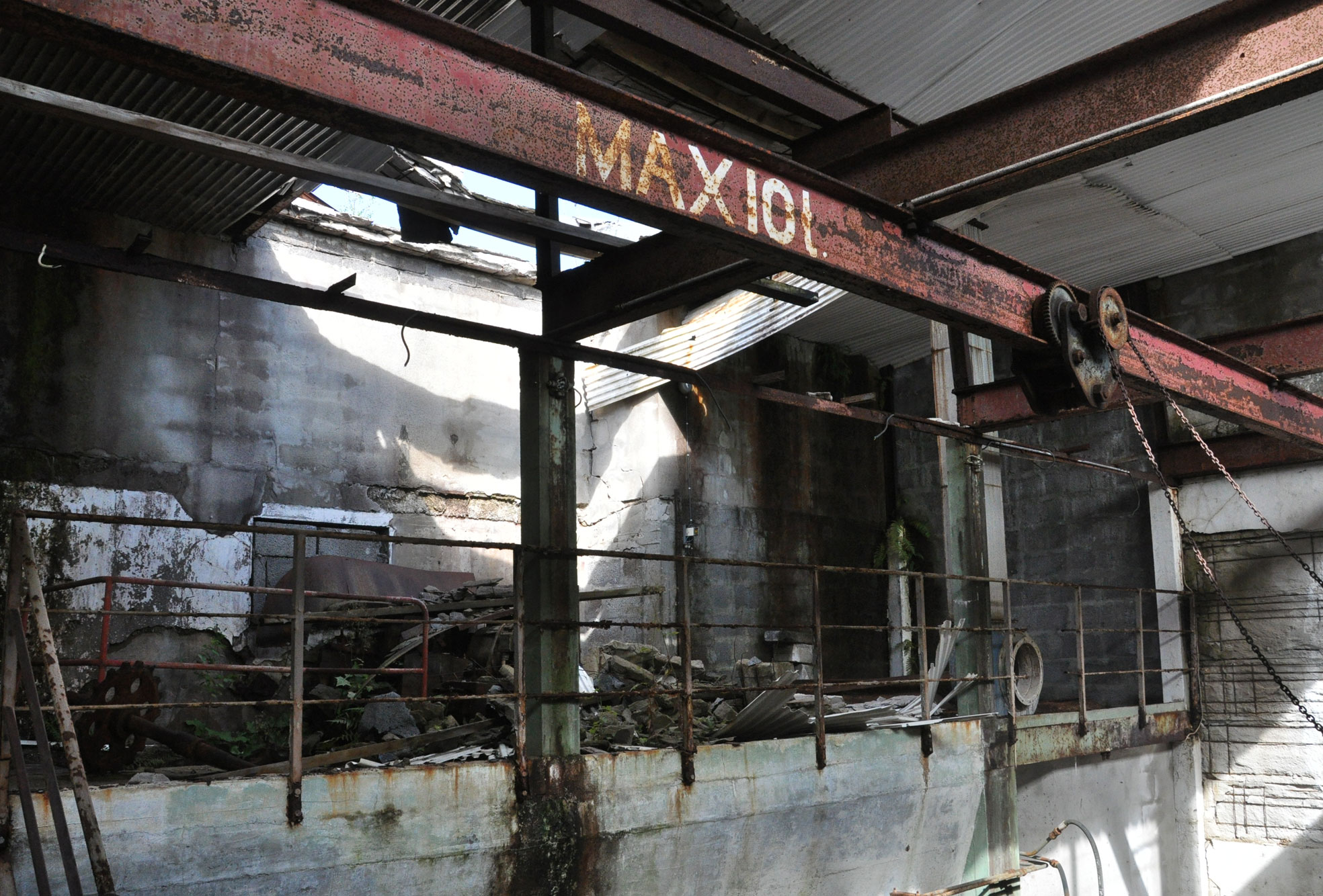
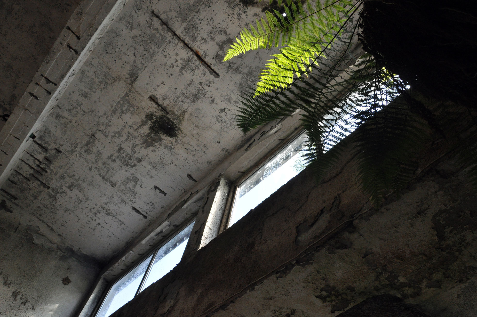
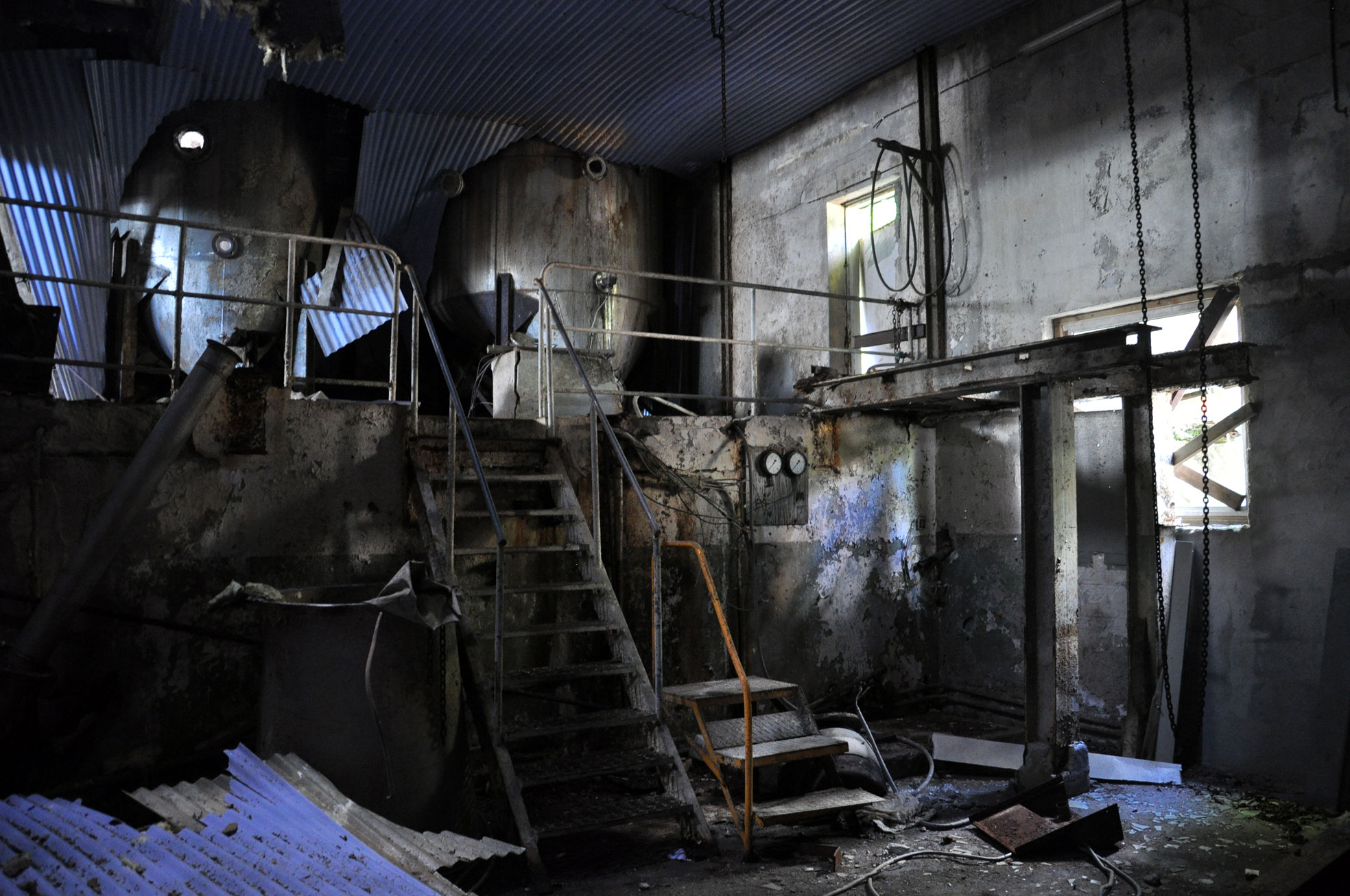
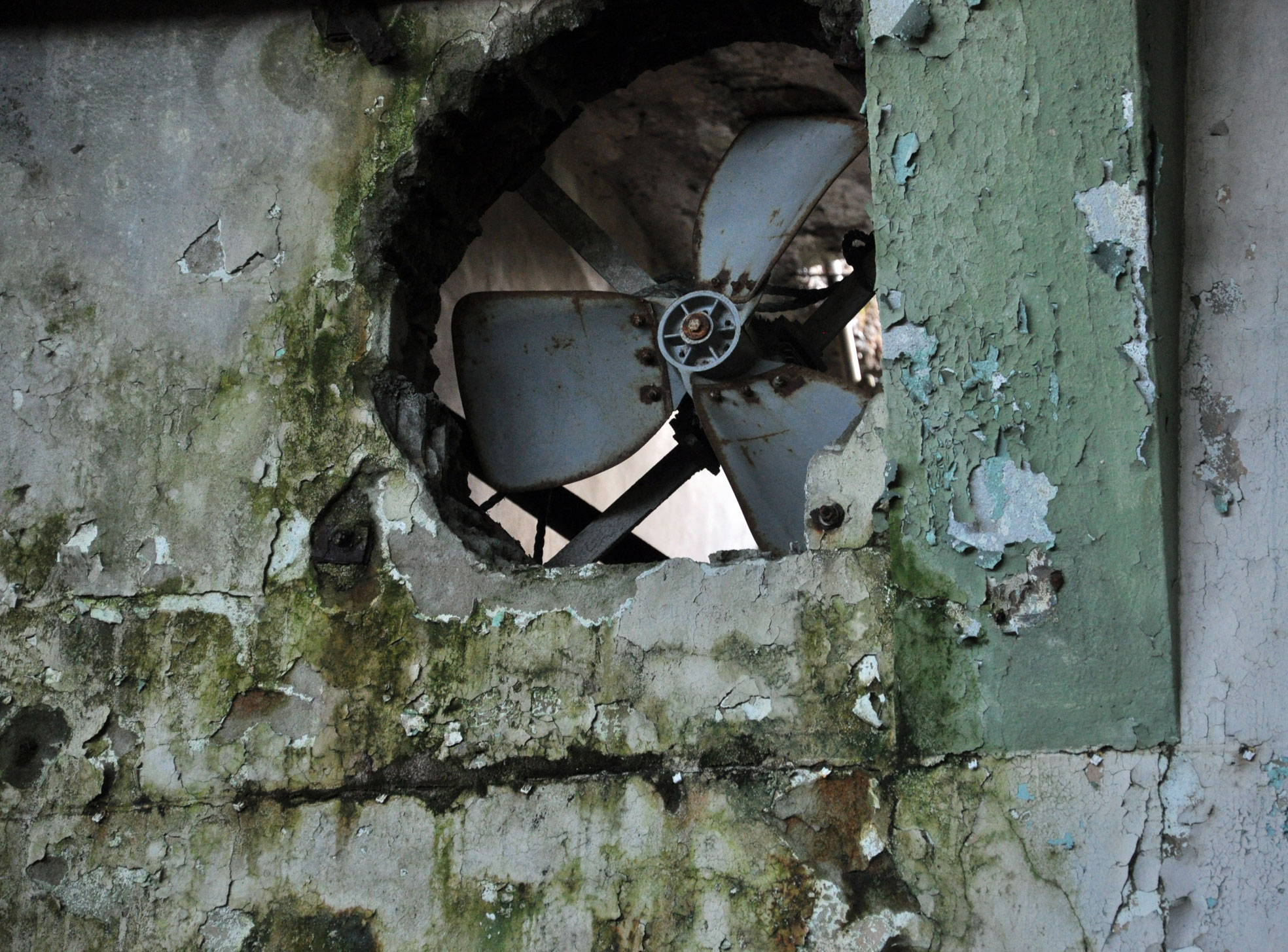
I’m fascinated by this decaying factory on the Norwegian coast.

DSC_8425
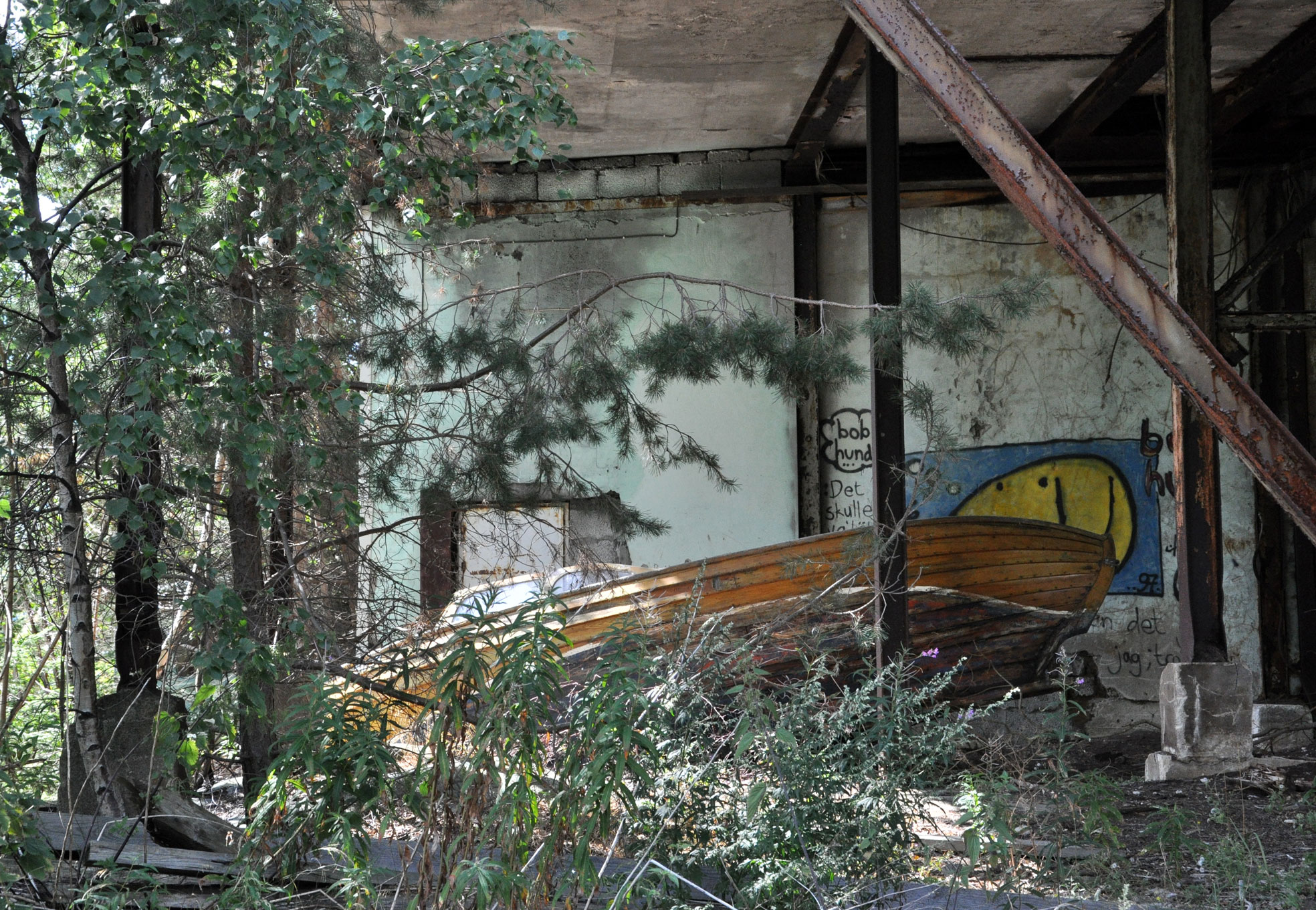
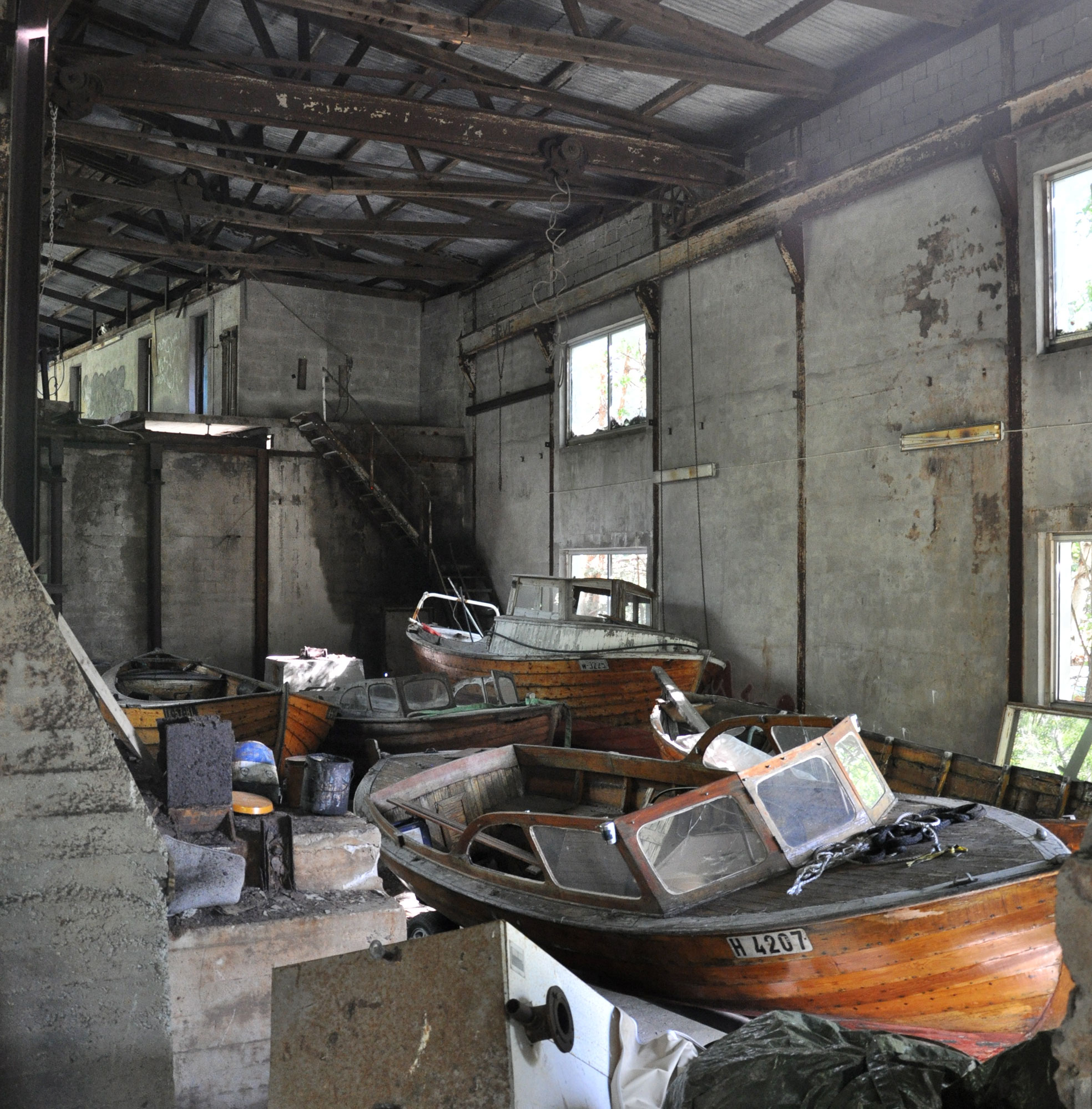
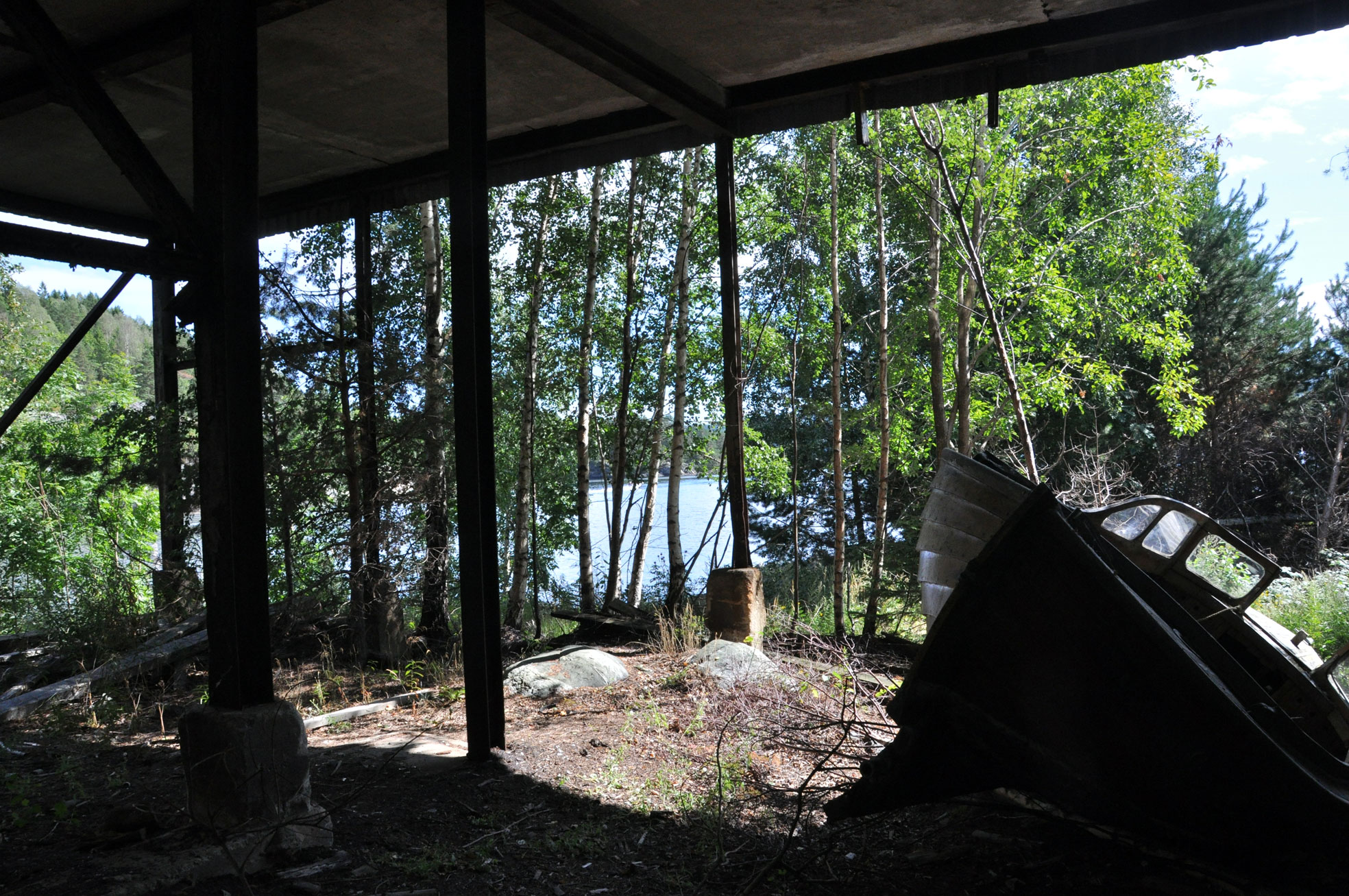
This site, where a river meets the labyrinthine Norwegian South-East coast, used to be a wood processing plant. Logs were floated down the river from a wide network of inland waterways, and processed here into tree pulp and such which was then shipped away. The first pulp mill (further up the river) started out as early as 1889; this newer facility was built in 1952. It was an important factor in the region until it closed its doors around 1988. Since then it has been decaying. Used by locals to dump disused boats, cars, and other scrap, the site has been periodically cleaned up, but its future remains unclear. An expensive proposal for residential/touristic redevelopment a few years ago was shelved.

DSC_8323

DSC_8307

DSC_8317

Boat graveyard in industrial ruins

DSC_8329

DSC_8330

DSC_8331

DSC_8332

DSC_8338

Upstairs in the main building, more boats.

DSC_8386

And so much more

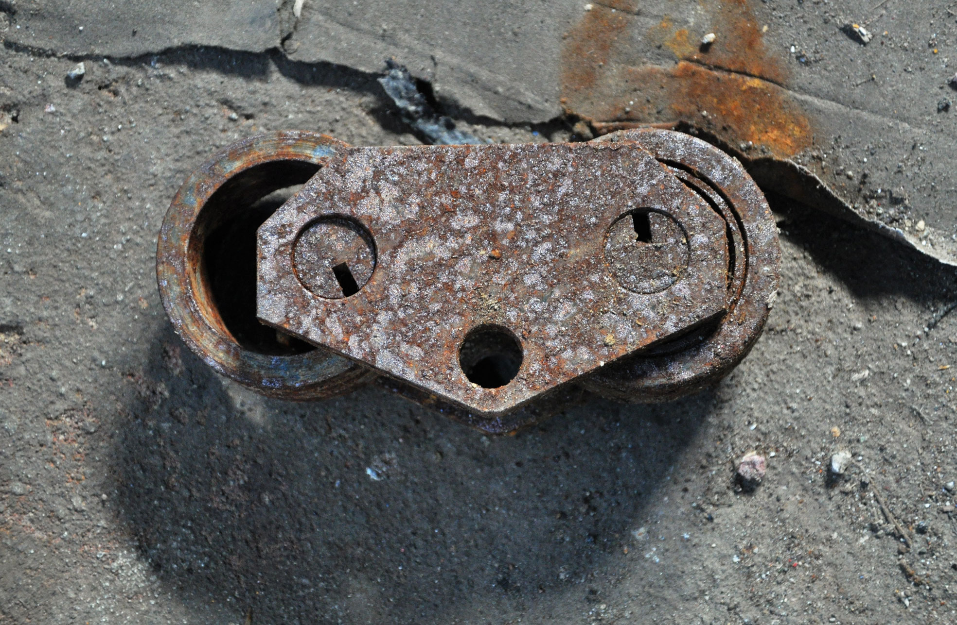
Pareidolic goodness.

Pareidolic

As if surprised by rust

DSC_8354

All that and a sewing machine

DSC_8392

DSC_8389

Stranded

Dizzying

Dizzying (I *think* this is horizontal).

Skylight

Skylight

DSC_8370

Former heavy duty.

DSC_8367

New life

Light

Bluelight

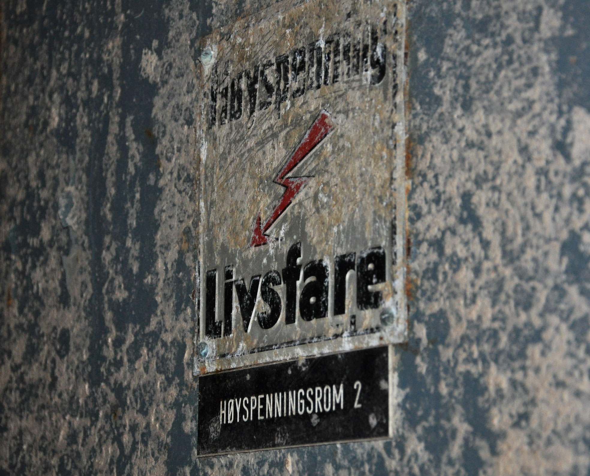
Danger, high voltage.

Danger, high voltage

DSC_8382

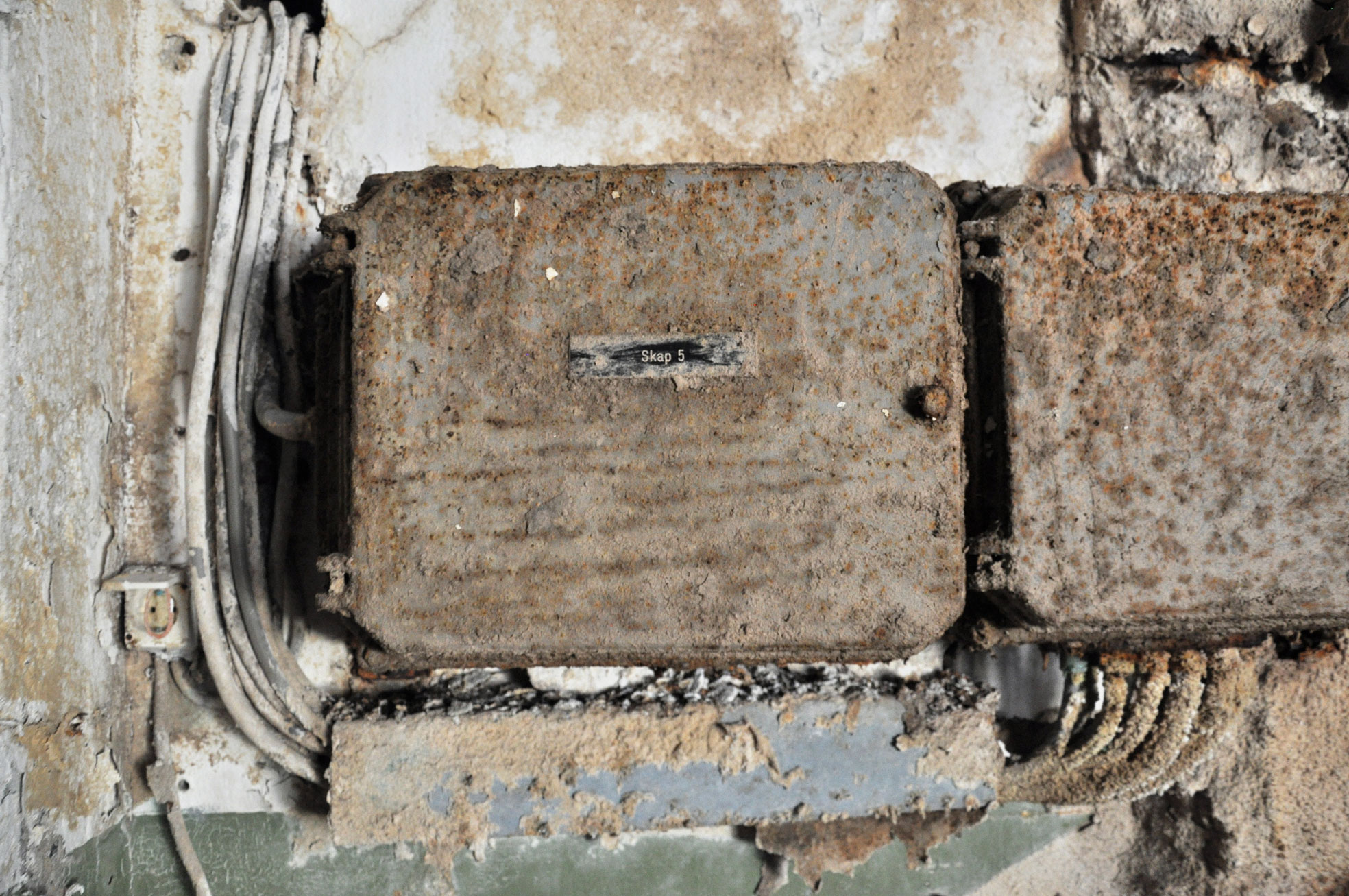
Fused

DSC_8356

Still

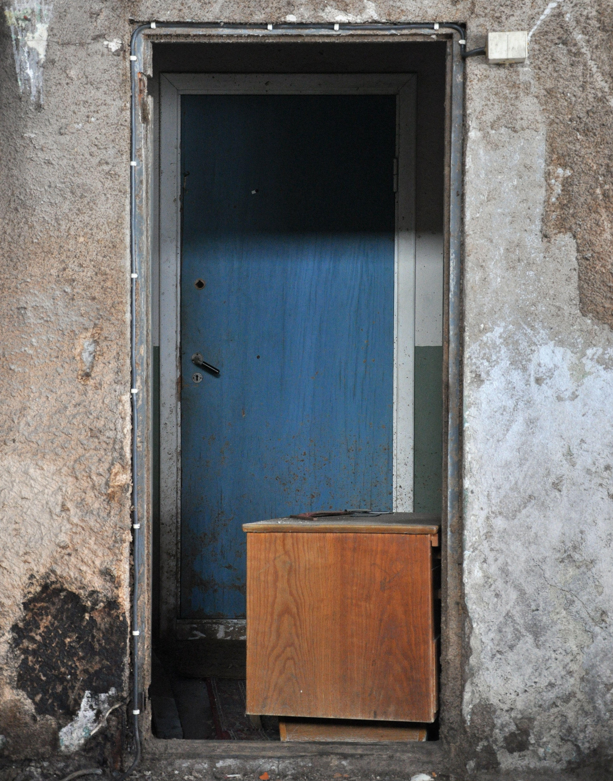
Blue door

Blue door

Out

Out

Harvest from a year of type

Beyond the piles of sketches, the writing and the stonecarving dust, here’s a look at the results of some of the bigger projects I worked on during my year at TypeMedia.

ParaLetters-ani-groot
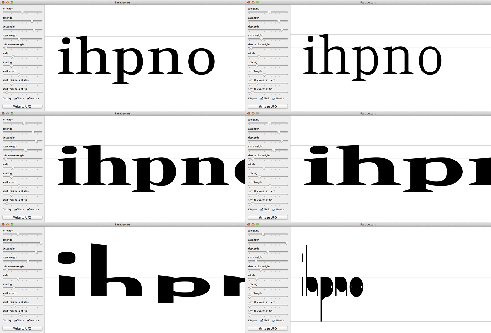
Exploring parametric lettershapes for Just van Rossum’s Python class. There is no “master” design here: Outline structures are defined as models and instantiated using a number of parameters. Other fun Python things included some recursive letters and the beginnings of the word-o-mat.


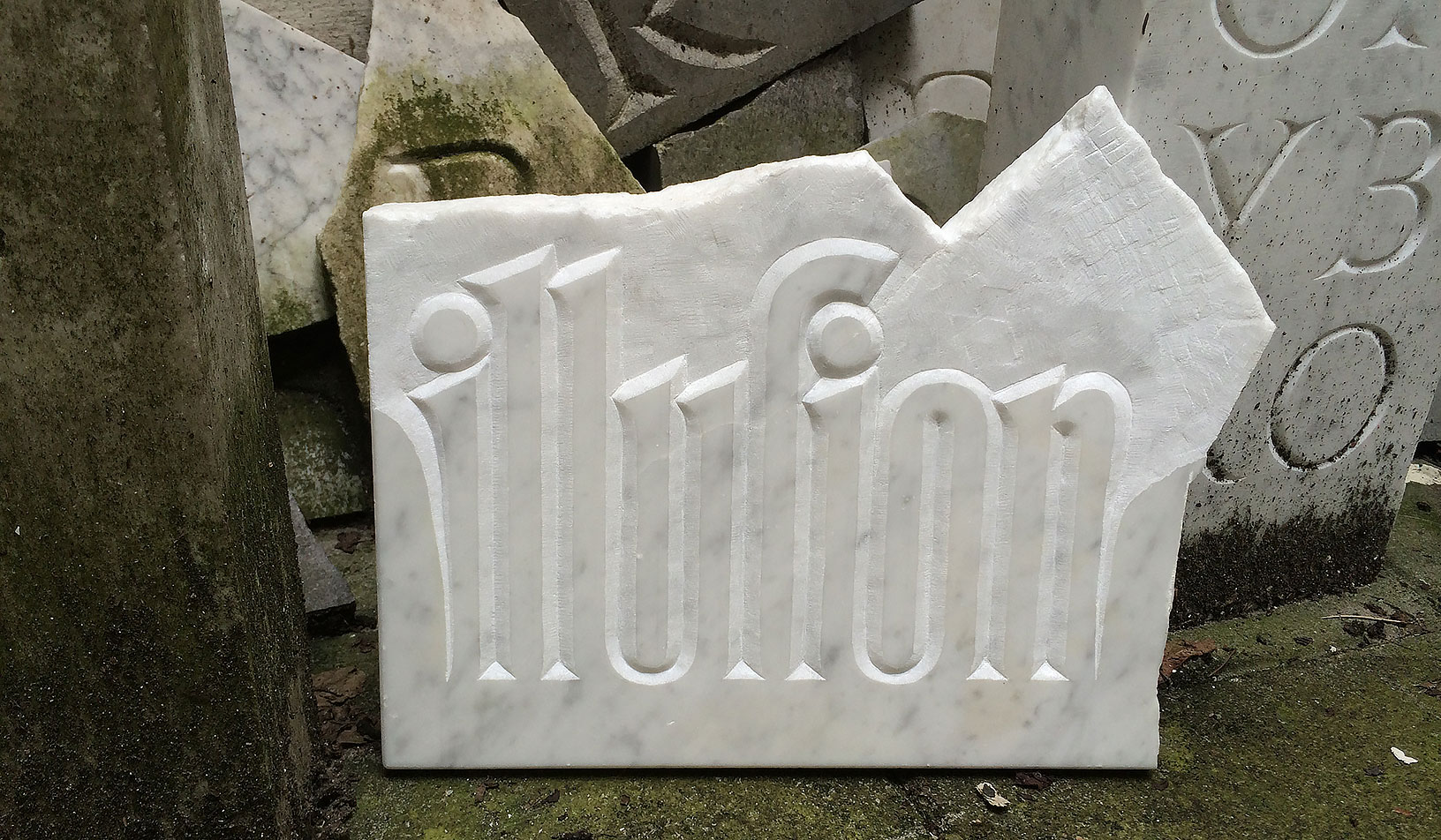
illusion
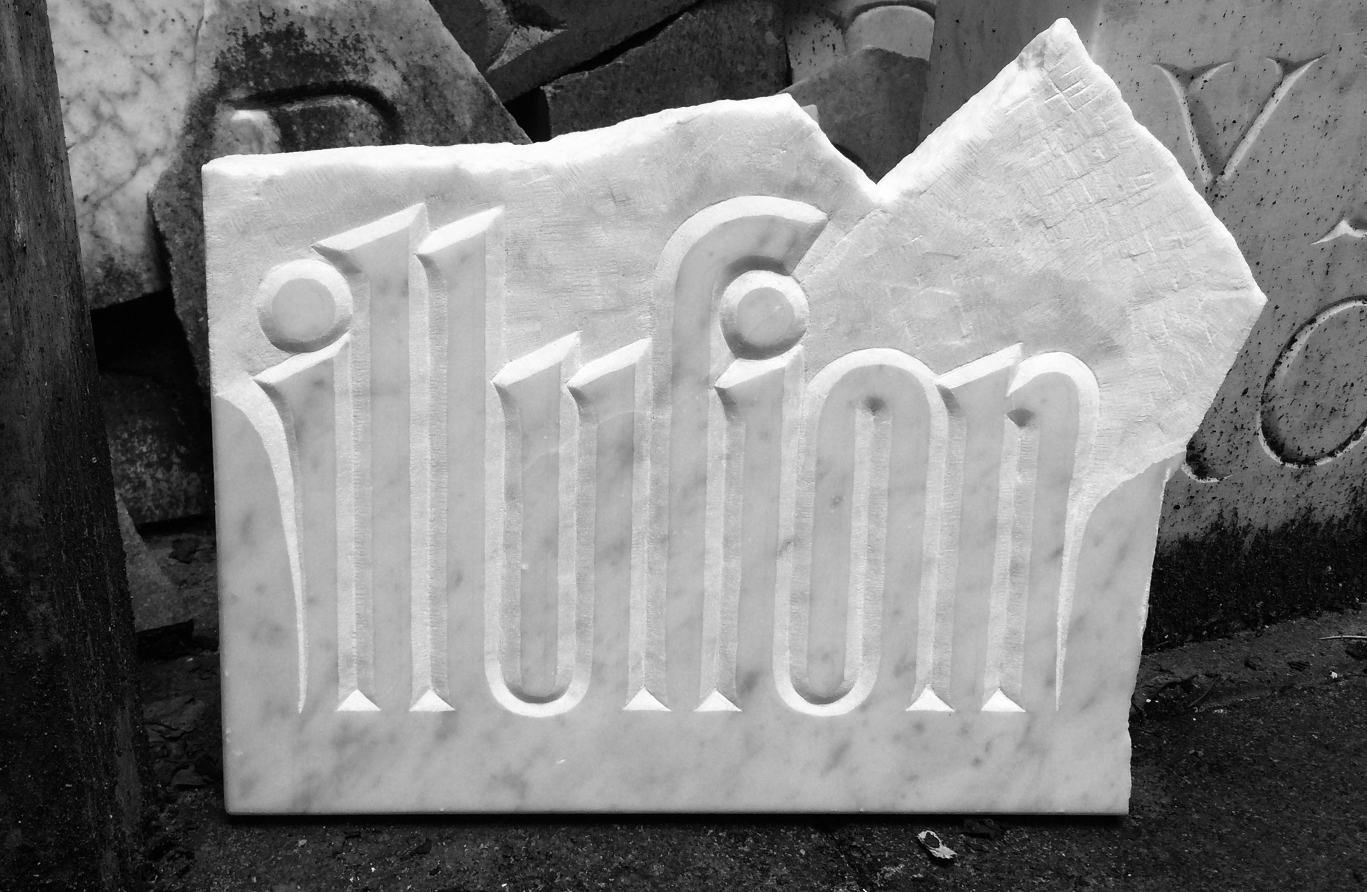
My stone for Françoise Berserik’s letter-carving class. Stonecarving was fascinating and opened up new perspectives on lettershapes and spaces. This piece was inspired by a sign error in my Python script that got me thinking about negative serifs.


Penglia
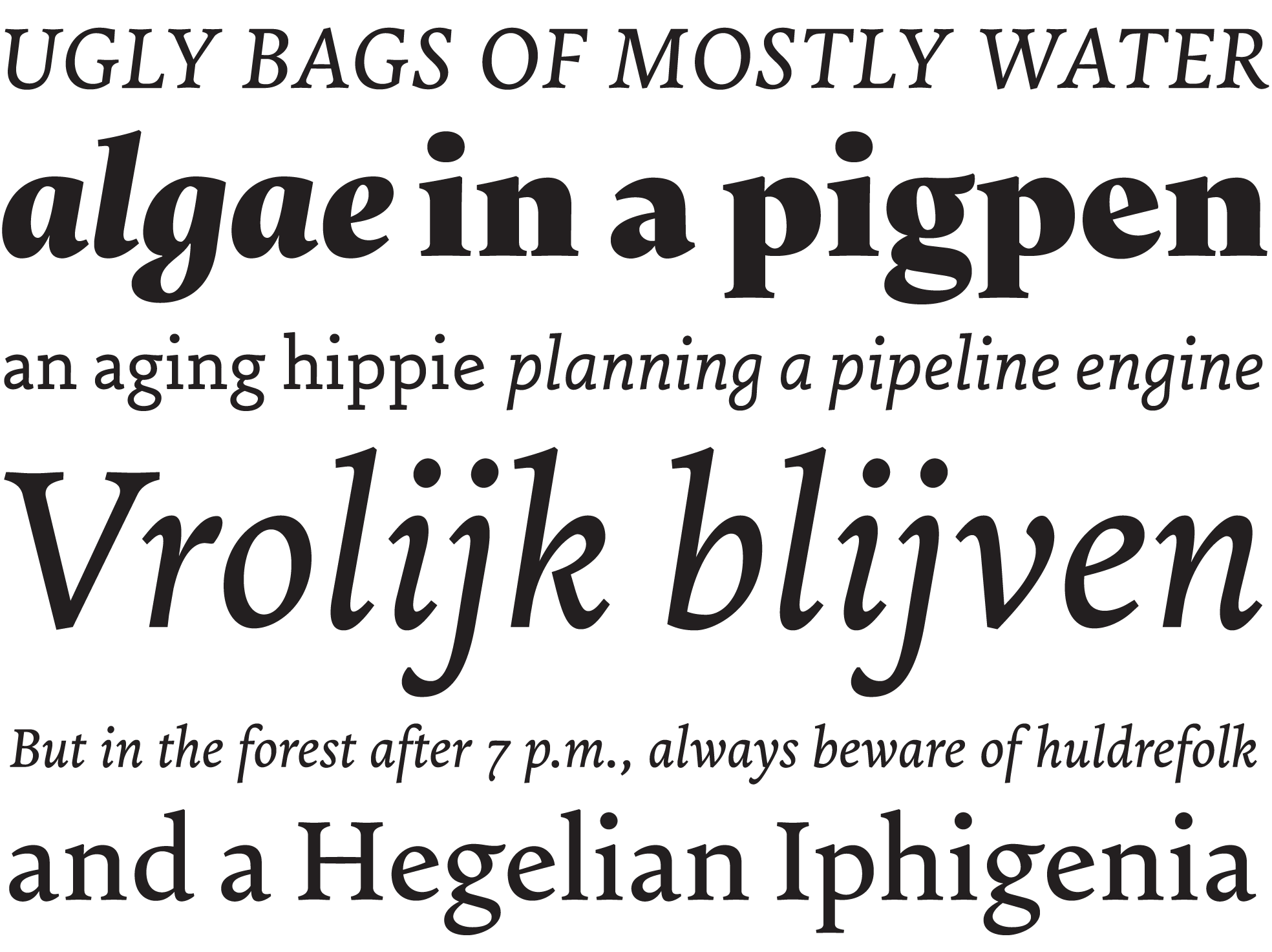
Penglia, a family based on writing with the broad-nib pen, for Peter Verheul’s class. We sketched six variants (low, normal, and high contrast) in roman and italic; my regular contrast ones are furthest along, especially the italic. Like the writing itself, this was really hard for me.


EamesGreek-2
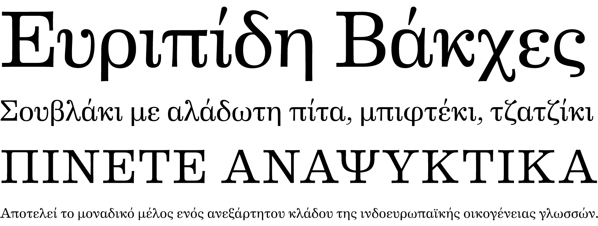
A potential Greek companion to Erik van Blokland’s Eames Century Modern for Peter Bilak’s class. This was a fascinating, if quite brief exploration.


Michiel
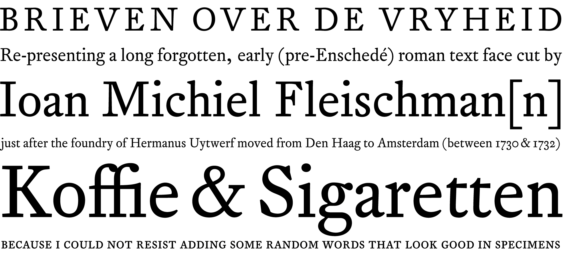
Michiel is my revival of an early typeface of J. M. Fleischman’s. The revival, taught by Paul van der Laan, was my favorite project in the first semester. This face feels less elegant and sparkly than Fleischman’s later work, softer and rougher at the same time; I’ve come to quite like it. There is only one style so far, but that one is pretty much complete. I’m thinking about expanding it further.


whispers2
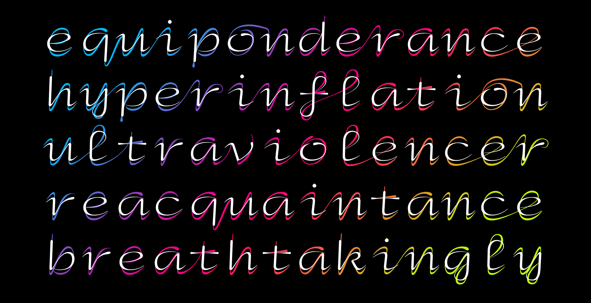
My contribution to the Chinese Whispers project with Typeradio and HBKSaar (see background and context on the Typeradio website). I would’ve never thought drawing a monospaced upright script with two layers could be this much fun. Sounds like the most useless thing ever, no? I’m still thinking about picking it up again.


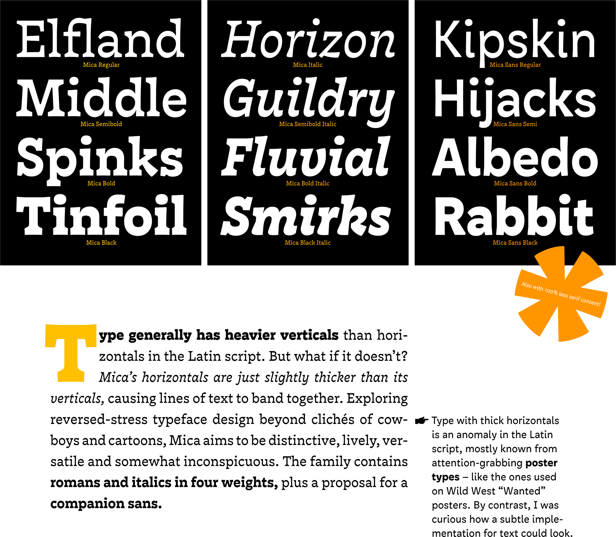
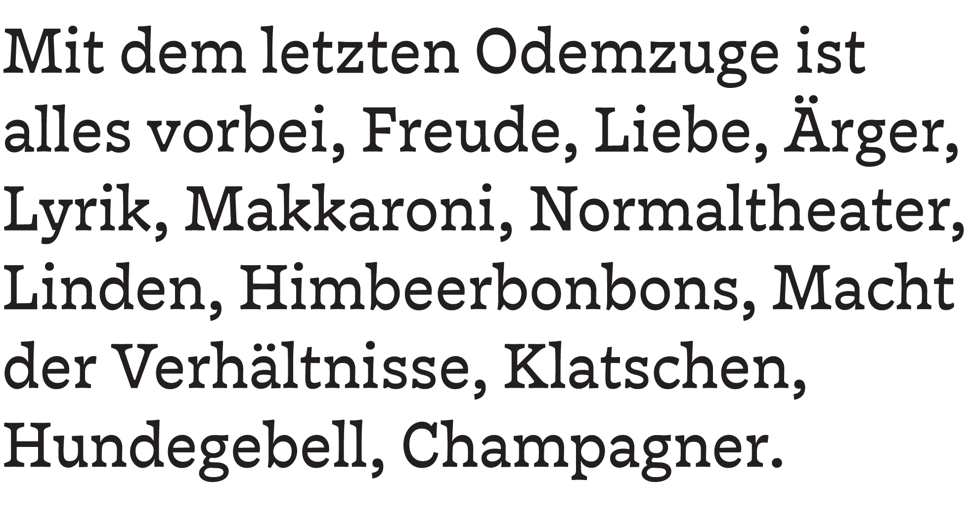
And finally, a look at Mica, my graduation typeface:

mica_posterquote2

mica_poster1

Heinrich Heine

More of Mica will be shown soon on the upcoming TypeMedia 2014 website.


Multi-component glue

As a TypeMedia student in the middle of her final project, one thing you get plenty of is feedback and critique.* Various quite brilliant (and usually Dutchly straightforward) teachers with razor-sharp eyes will notice and comment on different things almost every day, ask hard questions, and usually have entirely different ideas and recommendations. It’s your job to make sense of these things and sort out which leads to follow how far.
This is both tremendously helpful and a puzzle in itself. Most of the time I’m in a state of stronger or lesser confusion with a million unsolved questions floating around in my head.
In the best moments, all the separate bits of input (sometimes days, weeks later) react with the shapes on my screen, in my head like multi-component glue. Take two or more seemingly unrelated comments that I’m not sure about, mix in brain, let sit a bit, and suddenly they will solidify into something solid and new, a way I hadn’t seen, a new door that opens. It’s pretty great when that happens.

(* One thing you don’t get a lot of is time, such as for writing proper lengthy blog posts.)

Under Enschedé

vkrimpenweg

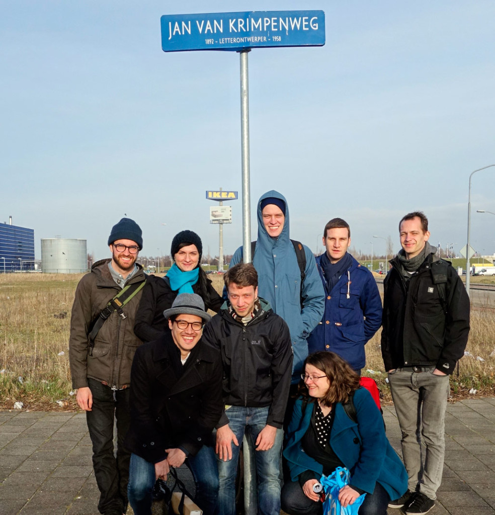
Back row, left to right: Alexandre, Slávka, James, Hugo, David; front row: Mark, Mark, me – we were staring into the setting sun, and this is about two seconds after I gave up. Photo taken by Jan Willem Stas.

I’m not going to apologize again for not posting more, mostly because I don’t like feeling like a broken record, and jump right into a story I’ve been wanting to tell: That of our excursion to Museum Enschedé in Haarlem, the archive of Joh. Enschedé en Zonen, printing business and focus point of the rich history of Dutch typefounding.

The roots of Enschedé reach back into the very matter I was researching earlier this (academic) year in my revival project: The typefoundry that Johann Michael Fleischman started in Amsterdam but soon gave up again (he was, endearingly, a great punchcutter but a lousy businessman) was taken over by a certain Rudolph Wetstein from Basel and later sold, among other material, to Joh. I Enschedé; that marked the beginning of their typefounding activities in 1743. The foundry grew quickly and sold the work of great Dutch punchcutters for centuries: besides Fleischman (who returned to cut the bulk of his work for them), names like Van Dijck, Kis, Rosart, later Van Krimpen and De Does come to mind.

This design legacy is carried on today by the Enschedé Font Foundry; but the company archive is in the basement of Joh. Enschedé en Zonen, which now focuses on specialized security printing for stamps and banknotes. This means that the building is highly secured, visiting it is kind of a big deal, and cameras are not allowed inside. While the lack of visual documentation is sad, not having a lens in front of my face also made the experience deeper.

So in early March, we traveled to a heavily secured and otherwise nondescript factory building in an industrial zone in the outskirts of Haarlem, where rabbits run on deserted lawns behind an IKEA just off a major road. It felt pretty anticlimactic until we had met the curator, Johan de Zoete, traveled into the basement of the complex, and crossed the threshold into his treasure chamber. There it felt as if time itself was holding its breath. Breaking down, laying bare its contents for us to see. Letters from centuries. Rows and rows of books, journals, boxes with letters and objects. Posters and prints hung framed on the walls. We were told to stay together, to not touch anything. We behaved, but I wanted to touch everything. I wanted to live there.

We wandered through the centuries, and Mr de Zoete told us stories, showed photo albums, Daguerreotypes and paintings, bibles and books. And type. Type that showed off the limits of what Enschedé’s master craftsmen could do: beautifully floriated Didot capitals with hair-thin lines; a four-point bible type whose metal was thin and brittle and the letter faces barely visible even through a magnifying glass. We shuddered to think how long that would take to typeset … We turned a corner, and there was Paul Rädisch’s workbench: It looked as though Jan van Krimpen’s punchcutter had just gone out for coffee, “look, everything is the same”, said Mr de Zoete, pointing to a photograph of Rädisch sitting at that same desk, all the tools in the same arrangement, “only the candle has burned down a little more” he said, insisting it was the same one.

History really comes into life and into context when it can be experienced like this. For instance Fleischman’s famous music type: I had known it existed, I had seen samples, but now it was lying there, in use in a violin manual by Leopold Mozart. (The father of W. A. Mozart; I’ve loved the famous son’s work since my childhood piano-playing days.) Realizing that that had then been a contemporary use … it was odd; type ages so slowly, and I easily forget how old it is, that Fleischman died when W. A. Mozart was twelve. I stood lost in thought, and Fleischman looked out from a tiny painting in which he looked wise and less ugly than in the well-known engraving (I remember thinking he looked a bit like Kevin Spacey). Around the painting were displayed his punchcutting tools, and I wished I could deduce something more meaningful from staring at these than “omg Fleischman worked with these 250 years ago”, but even that was pretty impressive.

I could talk about banknotes, envelopes, vignettes, furniture and stamps and books, but I will just mention one more amazing thing: Smoke proofs. I had read that punchcutters, while working on a punch, would take smoke proofs to judge their work; this involved blackening the punch over a flame (hence the candle on Rädisch’s desk) and pressing it – perfectly vertical, aligned to a guide – onto a sheet of paper, where the soot would leave an impression. It’s a quick way to “preview” a lettershape in progress, but what I did not know was that this is probably the sharpest reproduction one can get of type; and that it keeps. We got to see some of Rädisch’s decades-old smoke proofs of one of Jan van Krimpen’s faces. The soot stood black on the page, perfectly black, perfectly sharp. I held my breath, again.

We bought books. We said goodbye, and on our way home took the above photo, staring into the evening sun. Then we carried our books to the train, and slowly returned to the year 2014.

Halftime

Turns out people weren’t making stuff up when they said it would be busy at TypeMedia. :)
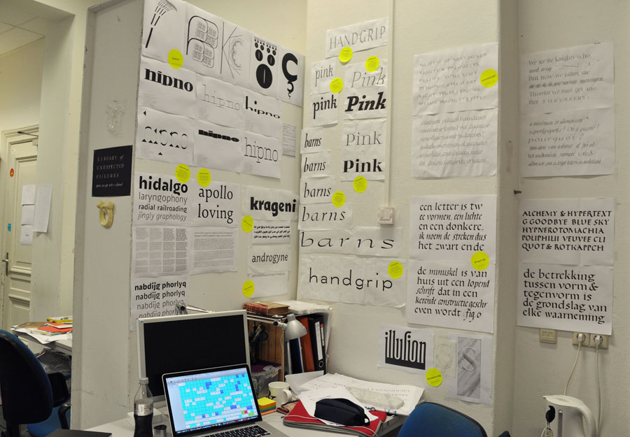
We have by now pretty much reached the halftime point (which baffles the mind, but that’s another story), and there is a little bit of time to breathe and write a few words. The first semester is over, we’ve presented and/or handed in all assignments so far (obligatory Asterix reference: all assignments? – no! One presentation is still coming up later this week). The mode in which most of the first-semester work was presented was to stick it all up on the wall for the teachers to examine and critique; sketches (paper and digital), attempts at writing with various tools, stonecarving*, programming experiments, a Greek companion to a Latin typeface, a broad-nib-based low-/normal-/high-contrast family, and a revival of a cold-metal typeface. Seeing all this work cover the walls of our nerdcave was… impressive. (»Man weiß auf jeden Fall, dass man was gemacht hat.«)
(* My classmate David literally stuck his stones up on the wall. They survived two falls.)

presWeek_1_kl

My desk with about two-thirds of my wall space for presentation week.

The first-semester project I am most excited about (although this is a really close call with the Python and the stonecarving) was the revival. When looking for a book with an interesting typeface to revive I had come across one that looked vaguely like Fleischman, but a bit more old-style, softer and less sparkly, with lower contrast. After a bit of research, the typeface turned out to be indeed by Fleischman, but/and one of his earliest ones – cut in his first three years in the Netherlands, when he was between 22 and 25 years old. I loved working on this; it taught me tons not just about design but also about how to structure and document such a process. Also, a great excuse to learn more about Fleischman, punchcutting, and Dutch foundries in the 18th century.

michiel_750

Michiel, my revival of Fleischman’s 1730–1732 Mediaan for Uytwerf.

I’ve probably said this before, but I can tell that I’m learning tons – I’m growing, in what I can draw, in what I want to draw, in what I see. The different tools and media and approaches and questions of the first semester have all given me new perspectives on lettershapes.
One thing that’s very much under construction is that I now find the type I made pre-TypeMedia tends to be static, and kind of cold. Probably a combination of my Swiss background, preference for simple shapes, and propensity for working directly in a digital environment. And the fact that I like to be in control and I’m tense. (That’s what Françoise sees, my amazing stonecarving teacher. She sees it in my writing, too. I know she’s right.)

It’s not like I think all that is fundamentally wrong (well, except the tenseness maybe). I like (seemingly) simple designs over complicated and ornate ones, and I’m not a fan of type that is overly imitative of writing. But one thing I’m trying to absorb from all this Dutchness around me is to get a little more life into the lines I draw. I’m still exploring what exactly that means, but sketching seems to help (as it does overall with contrast, rhythm, proportion, spacing etcetera).

And sketching will be filling most of my waking life in the coming weeks, apparently. I’m excited to be starting out with the final project, looking ahead at weeks of playtime. (Bear with me: I won’t share for a while what I’m working on; it’s still a very fragile little plant.)
“Go explore the designspace” they said. FOR A MONTH. I can’t even remember the last time I had this much time to play, and explore, and try out things, and fail, and try out tools, and ideas, and navigate the designspace and have enough time to sail really far out. I’m telling you, TypeMedia is some elaborate typographic form of paradise.

No regrets in letter wonderland

desk

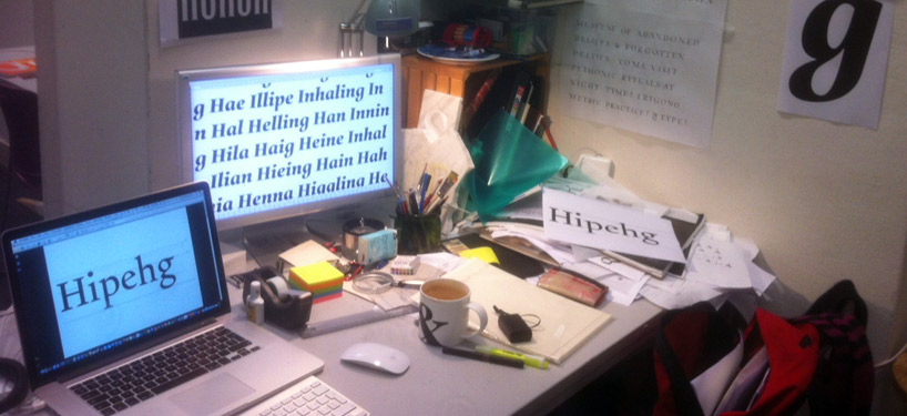
My happy little messy letterfilled corner of the world.

Every time I look back at this blog, two things hit me: (1) Whoa, it’s already been <number of weeks> since I’ve blogged huh where the hell has the time gone!? And (2) hm since then I’ve done and learned so much that I should write a book not a blog post. I won’t write a book.

It’s definitely getting busy here, and there is so much learning. Off the main stage of type, what feels like a big breakthrough right now is that I’m slowly getting my head around a more object-oriented approach to programming. I’ve been scripting for years (and happily), but between my self-taught JavaScript, ActionScript and PHP, I was stuck writing inefficient and poorly reusable spaghetti code. Years ago I used to say I code like I ski – it doesn’t look pretty, but I’m happy if it works, is approximately fast enough, and everything is still in one piece afterwards. Well, I’m learning to ride a jetski now. Our Python classes with Just van Rossum have been catalyzing a change of thinking into what feels like higher-level abstraction. I published my first little RoboFont extension last week (it makes test words), and have officially tasted blood. :) It feels like peeking over a ridge on a mountain hike and seeing a whole landscape unfold… With a scriptable type editor and this, the possibilities seem vast, and I’m beginning to feel the process as something fluid and malleable rather than something fixed, predefined and “correct” to follow. This is exciting. Code empowers, people. Thinking empowers.

These days, most of my time goes into the Revival project with Paul van der Laan; this is pretty complex and difficult (and probably my favorite project right now). Also here, I feel that I learn a lot not just about drawing letters, but also thinking about how to approach the whole thing, what to draw, and how to set up my process – in a project like this, it’s easy to get lost in details, in a deluge of data, and hard to keep on track. – The latter is sort of generally true because we’re doing a lot (not that I’m complaining), between having started my final stonecarving piece, sketching out a family of six broad-nib-based text fonts, drawing Greek… and with Erik van Blokland we’ve been TypeCooking – something I’ve done before, but now it counts, and it’s faster, and so much fun.

The longer I’m here, the less I regret not doing this earlier. When I applied to TypeMedia, I felt a little odd for doing so at the age of 34; it just happened that way, I studied late, came to type design late, then worked, etc.; back then I sort of wished I’d gotten into the groove more quickly. But why? I’m not really sure, and now that I’m here, it’s just all exactly good. This is not to say that doing this at a younger age (as most do – most of my classmates are between 25 and 30) is a bad idea. But everyone is obviously different, and personally I appreciate having a bit of experience under my belt that I can draw from, a bit more knowledge perhaps of myself too. And really, it’s not like I’m learning any less for starting off with more experience in some fields (and for the record, I have none in others).

Mostly I’m just very grateful to be here, to have gotten to a point where I could up and leave – and come delve into this letter wonderland we’re in, with this great little group of lettercrazed people from all over. And if the humor ever gets too immature for my ripe old age, I just try to tune out. ;)

IMG_9642

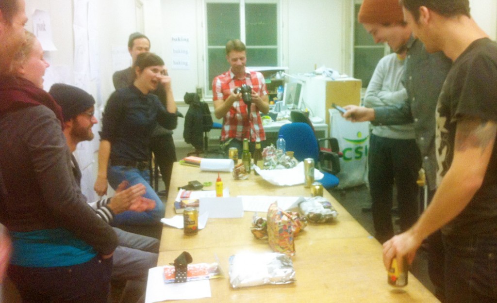
Pakjesavond at Type & Media. Did I mention I really like this group?